BIKEY Application UX Case Study
Personal project - 2023
Companion app for e-bikes and scooters to display vital information
BIKEY App UX Case Study
Personal project - 2023
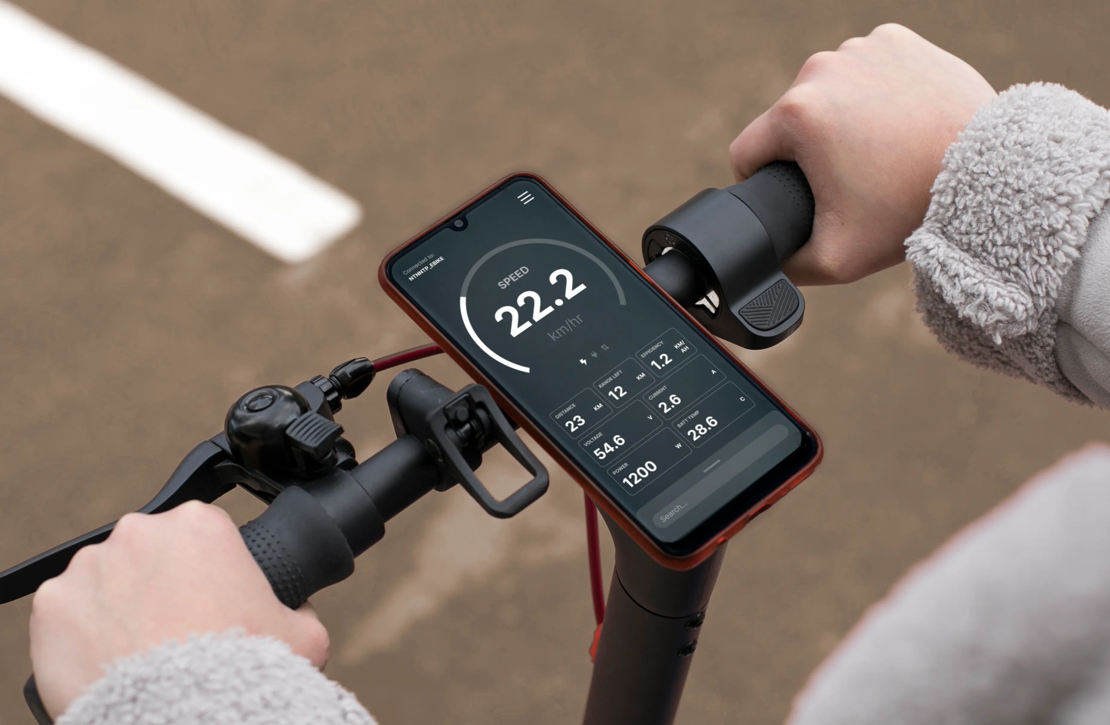
Bike in check, ride without wreck!
The BIKEY app companies e-bikes and scooters with user-friendly features , enhancing the integration between the vehicles and smartphones. It aims to make commutes more efficient and enjoyable.
What is "BIKEY" application
BIKEY is a dashboard application for supported e-bikes and scooters (specifically using JK/Jikong BMS*) to monitor information and provide useful features while commuting. Together with supported hardware, it can enhance the commuting experience, promote commute efficiency, and ensure user safety in emergency situations.
*BMS stands for Battery Management System.
Project objectives
Design a companion application for smart e-bike and scooter users to enhance functionality, safety, and convenience.
Project statusIterate
The UX design part was finished in July 2023. Further design iterations and revisions will be made, and after finalisation, Nuttapong will start to learn Swift and hopefully finish the app.
I heard "BMS"... what is that?
See that black box? That's BMS - Battery Management System.
It's a crucial device found in e-vehicles that manages charging, power output, and safeguards the battery. Without it, the battery risks damage, overheating, excessive charging, or power overload, which could be expensive to replace and even lead to explosions.
There are normal BMS, which comes with preprogrammed parameters and nothing else, but what we are working with is the smart BMS, which can communicate via Bluetooth and have extended functionalities, like this one.
If something is smart, isn't there an app for it?
Yes, there is.
However, there's a problem: the available apps are either lacking in features, not visually appealing, or both. Through research, I will soon uncover the user's unmet expectations and the difficulties they face while using these apps.
Competitor analysis
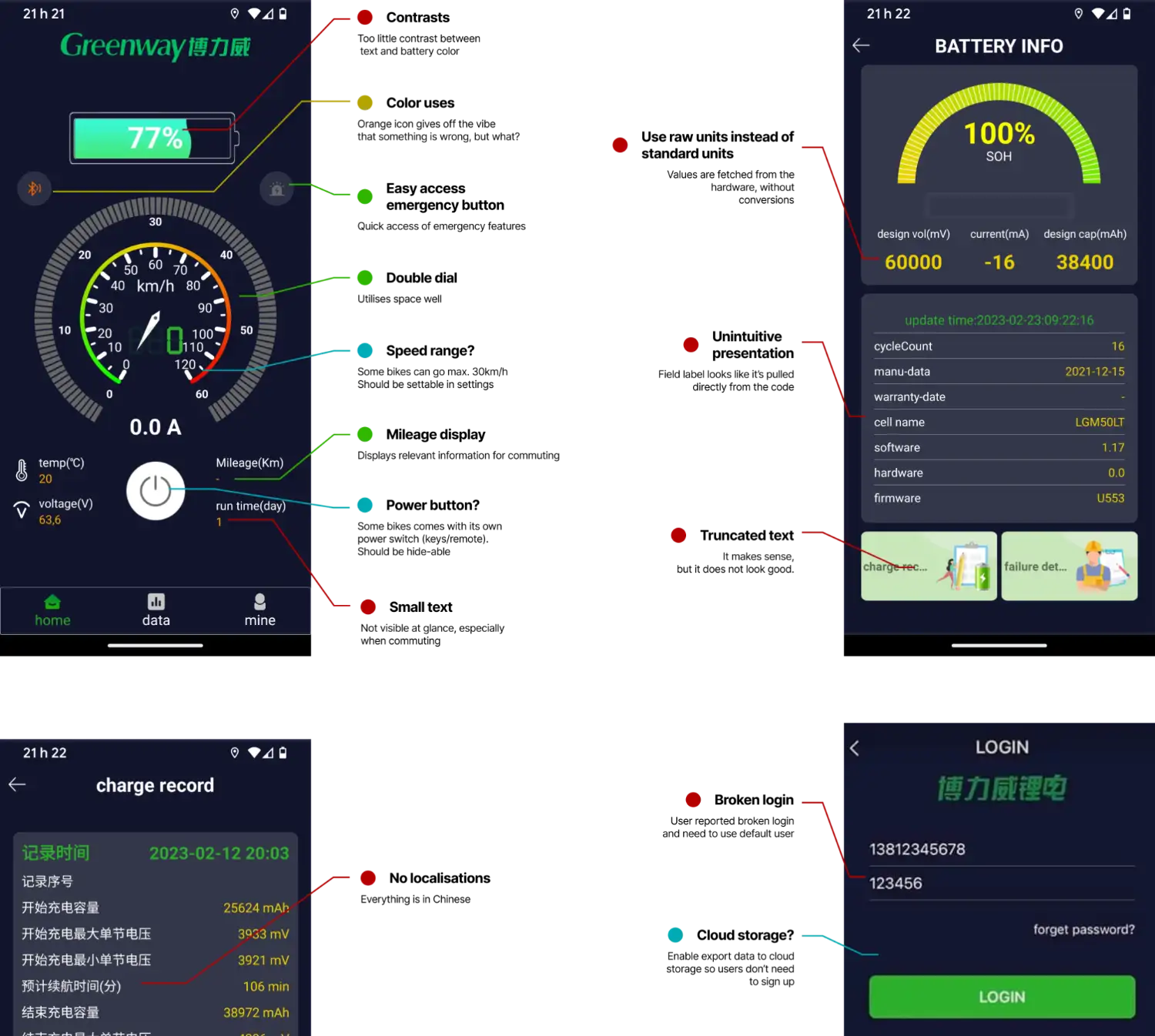
Talaria
This is the closest of the app we are designing. The app is made by battery manufacturer Greenway. It features connection to BMS as well as providing useful commute information. However, the app appears to be experimental, and some features are broken. The app is only available via Android platform, leaving iOS users behind.
Here is my analysis of this app:
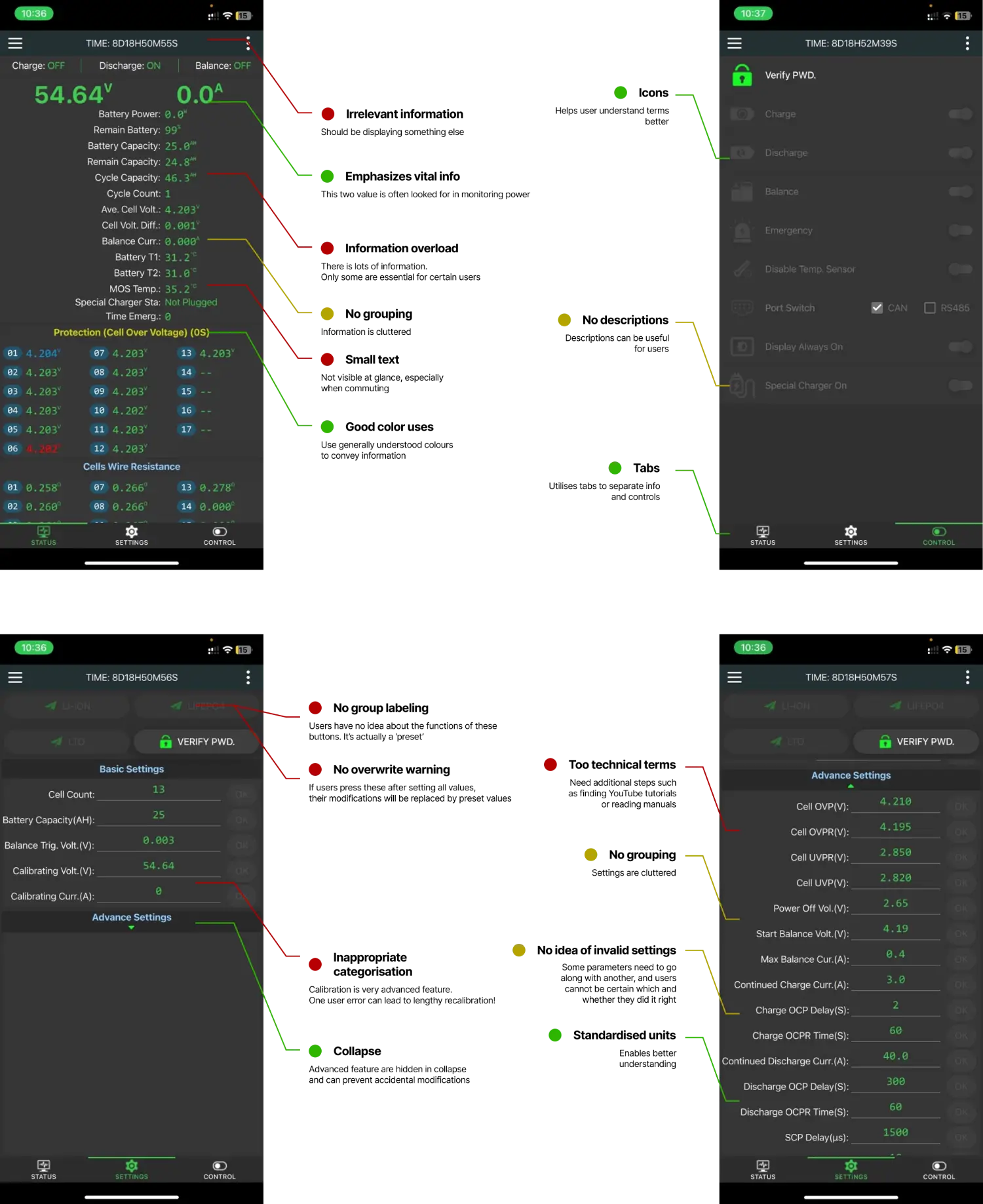
JK BMS
This app is primarily used to monitor battery in power walls and battery packs. The app is made by BMS manufacturer Jikong BMS. It indeed features connection to BMS and configuration of parameters, but did not feature anything related to the commute. The app works 95% as expected — it's just very cluttered and hard to understand.
These are what I have found:
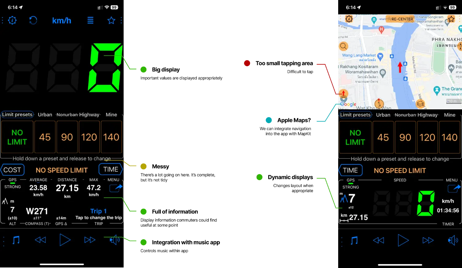
Related app: Speedometer
This app is... a GPS speedometer. It indicates the phone speed in a big digital-style text, together with commute-related information like trip distance, time elapsed, elevation, integrated maps, and more. As this app is not specific to e-bike or scooters, it lacks the BMS connection feature.
This is my analysis for the app:
User reviews and discussions
Despite very limited user reviews and discussions, I managed to gather some valuable insights regarding these apps from online e-bike forums, battery building forums, and Reddit communities.
Qualitative research
The casual interview (or as I called it a discussion/talk) was conducted with 24 years old office worker. Insights and statements from the interview is synthesised into user personas below for easier understanding.
User personas
Boong
Male, 24 yr.
Graduated Bachelor's Degree, working as a Marketing strategist in Bangkok, TH
Lives with family
E-bike is the best way to commute ever! I don’t need to cramp inside crowded trains, and I don’t have to be stuck in a forever-stuck Bangkok traffic!
Boong lives in the outer area of Bangkok, and he needs to travel almost 40 kilometres roundtrip everyday through heavy traffic. He always uses his e-bike to its very limits, and often comes home with a few percent of battery left. However, with new routes, he wasn’t so sure if the bike will make it home, and when there are detours while travelling home, he sometimes stuck on the road as the bike cuts the power off.
- To be able to travel even in heavy traffic
- To have more time for himself
- To find limits of his bike
- To succeed in things he do
- He doesn’t like mishaps that derails him from his plan.
- He hates unpredictability
- He doesn’t like it when he cannot monitor things - he feels insecure.
How might we help Boong make a successful trip to home every time?
Sarah
Female, 32 yr.
Graduated Master's Degree, working as an accountant in Adelaide, Australia
Lives with family
I use e-scooter to travel around my hometown. It’s affordable, and it’s basically free!
Sarah is a nine-to-five worker in outer area of Adelaide, Australia. She travels with e-scooter a lot as it’s more efficient and cost-effective. Her vehicle has the smart BMS, but did not use them as much since it’s not useful enough. She has rigid plans, and always head home after work. She is very careful and strategic in what she has done.
- To earn and save money as much as possible
- To provide for family
- To optimise every steps in her life and ensure everything is going well
- She hates waiting. It wastes her valuable time.
- She doesn’t like the idea of not having control in elements of her life
- She hates risky decisions.
How might we help Sarah make more efficient commute decisions?
Empathy maps
 Boong
Boong- I used the BMS app to monitor data of my e-bike
- Traffic jams still affects the e-bike range as I have t brake and accelerate a lot
- I know how far I can go, so I plan everything in my head
- Sometimes I am stuck on the road and have to pedal my way home
- I want to know how fast I’m travelling
- I want to use this bike to its fullest
- Uses his e-bike to its limits
- Mental calculations on his commute range
- Find new routes to avoid traffic
- Monitor his bike stats when riding
- Anxious when battery starts to run out
- Superior in using e-bikes
- Victorious when he made it home with additional detours
- Insecure when he can’t monitor things to make predictions
- Frustrated when things did not go well
 Sarah
Sarah- I used the app for BMS only few times
- The app is not very helpful. I see no point in using it.
- E-scooter is very efficient way to travel
- I plan my rides, to avoid sticky situations
- I don’t like it when things are getting out of control
- Is there any way that I can save even more money?
- How can I do things better?
- I should be really careful in travelling with e-scooter
- Use the app to control the e-scooter functions if necessary
- Use typical solutions to control e-scooter power such as remotes and keys
- Plans the travel beforehand if she’s going somewhere new
- Abort the trip if she thinks she will not make it home
- Confident in her pre-planning
- Curious in finding ways to optimise her financials and daily lives
- Insecure without plans
- Anxious with uncertainty
Summarising pain points
At this point, we now understand what users might need to go through in their journey. Let's do a rundown so we can clearly define the problems we need to address.
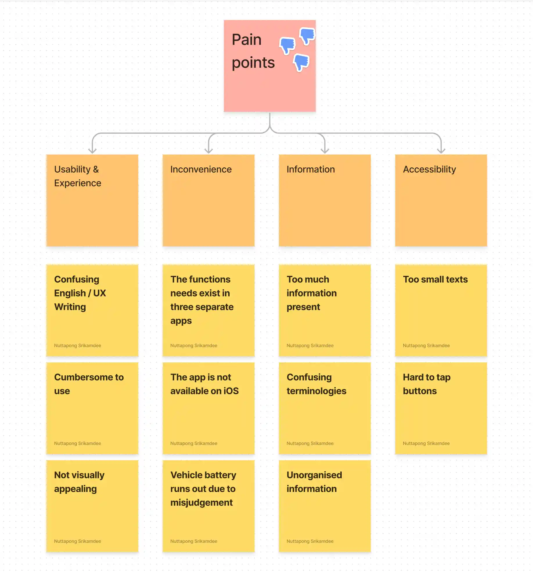
Pain points - Click to view in fullscreen
How Might We solve the problem?
To understand these pain points, insights, and issues easier, these are digested into these "How Might We" statements
So, How Might We...
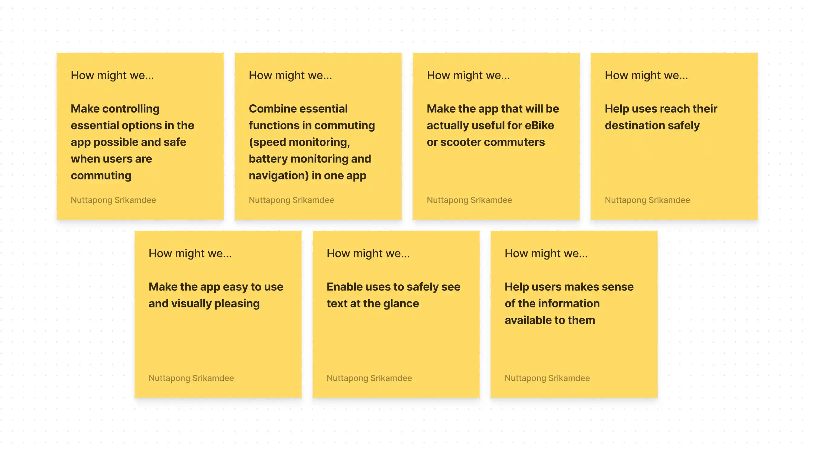
How Might We - Click to view in fullscreen
Affinity mapping
We have truckloads of insights already, but it's very cluttered. The affinity mapping will provide a bigger picture of these insights. In this project, it helped me identify the "big keywords" of a group of issues.
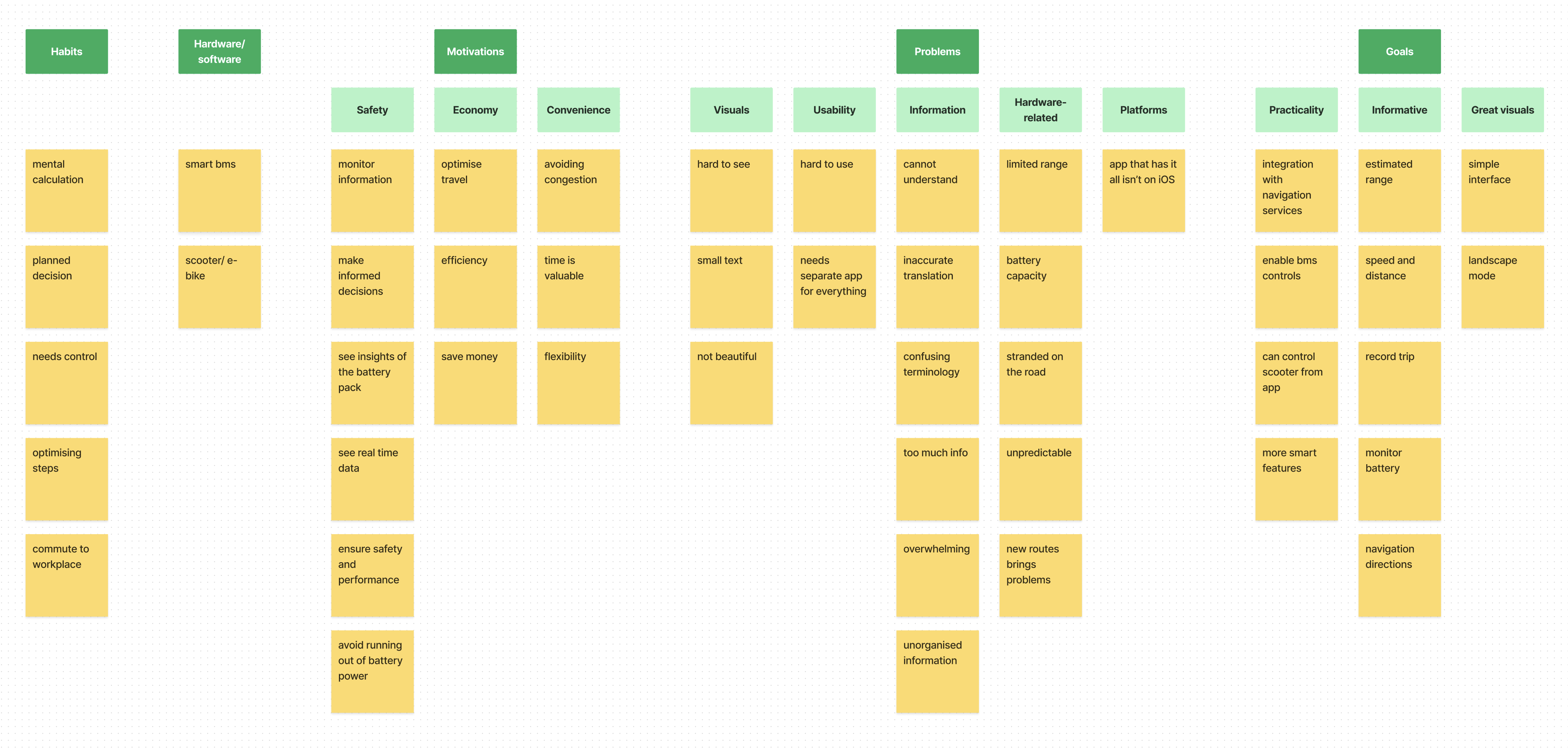
Affinity mapping - Click to view in fullscreen
Organising information architecture (IA)
Now, I'll use the card sorting method to better make sense of important informations that will be presented in the app. By listing out the information needed and group them it helps both us the designers and users to understand and create connections between elements better.
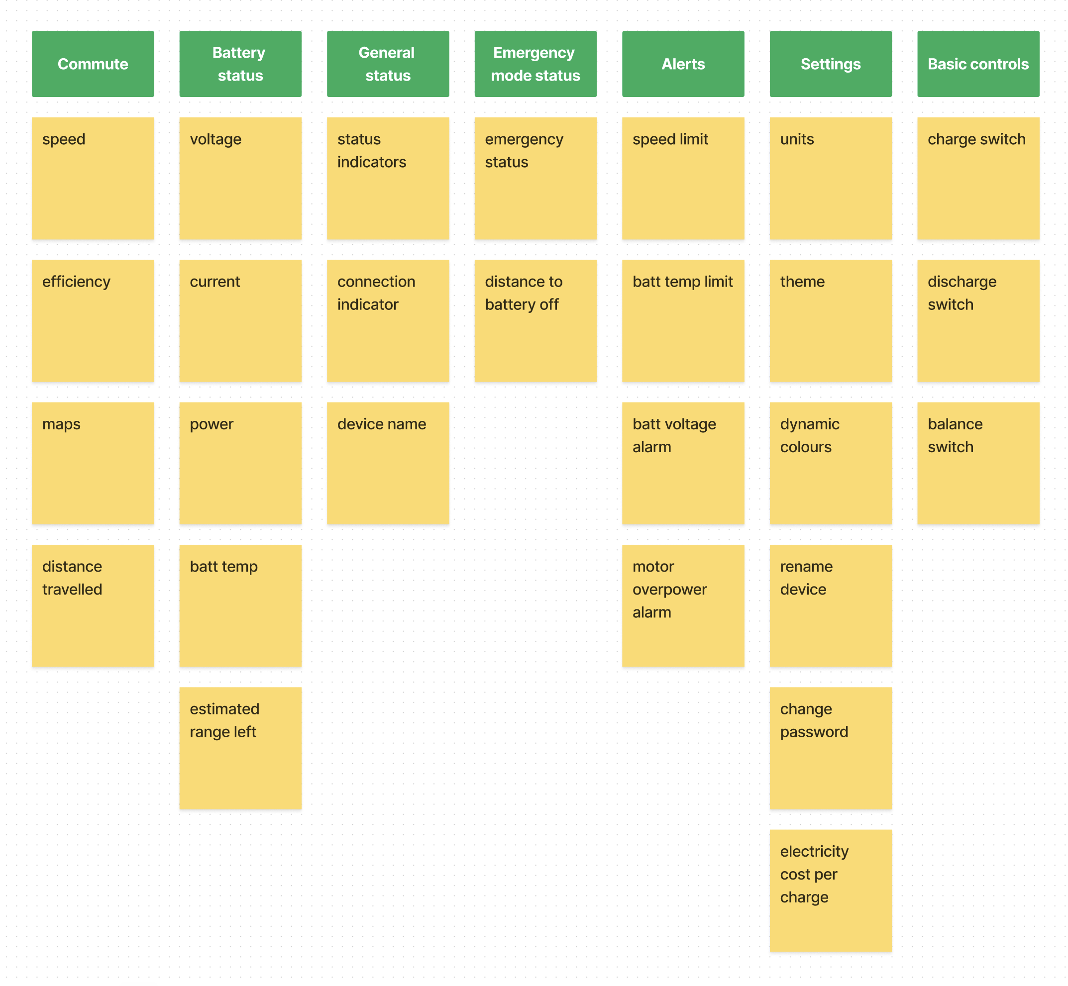
Card sorting - Click to view in fullscreen
User flow and user journey
This is the typical user flow of a trip with e-bike/scooter. Notice how seemingly simple tasks are actually complex and full of tasks...
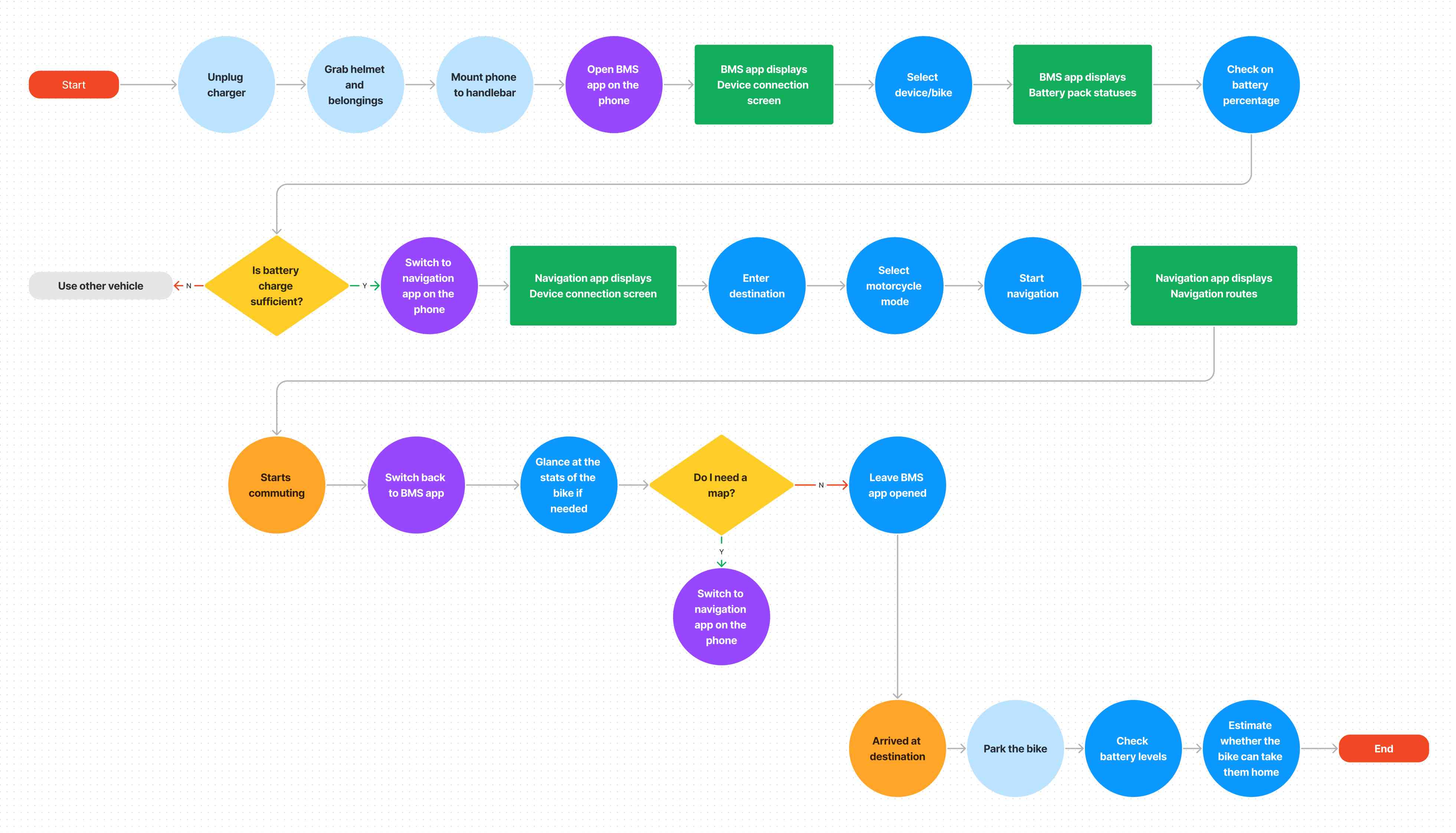
User flow - Click to view in fullscreen
The detailed user journey can be seen below. Additionally, I have added the improvement opportunities where we can better help users commute to their destination more smoothly.
Goal: Commute to destination
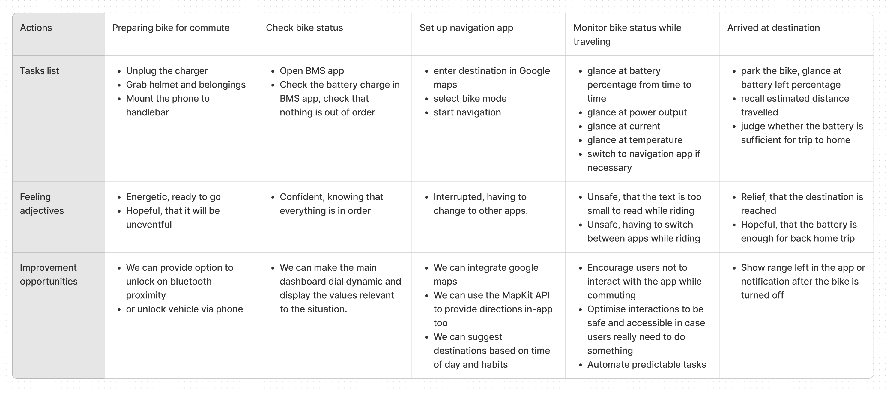
User journey - Click to view in fullscreen
App sitemap
Now, I've took some time to come up with the app sitemap. This map will shows how navigating in-app will look like. You can see how the app is very linear and simple.
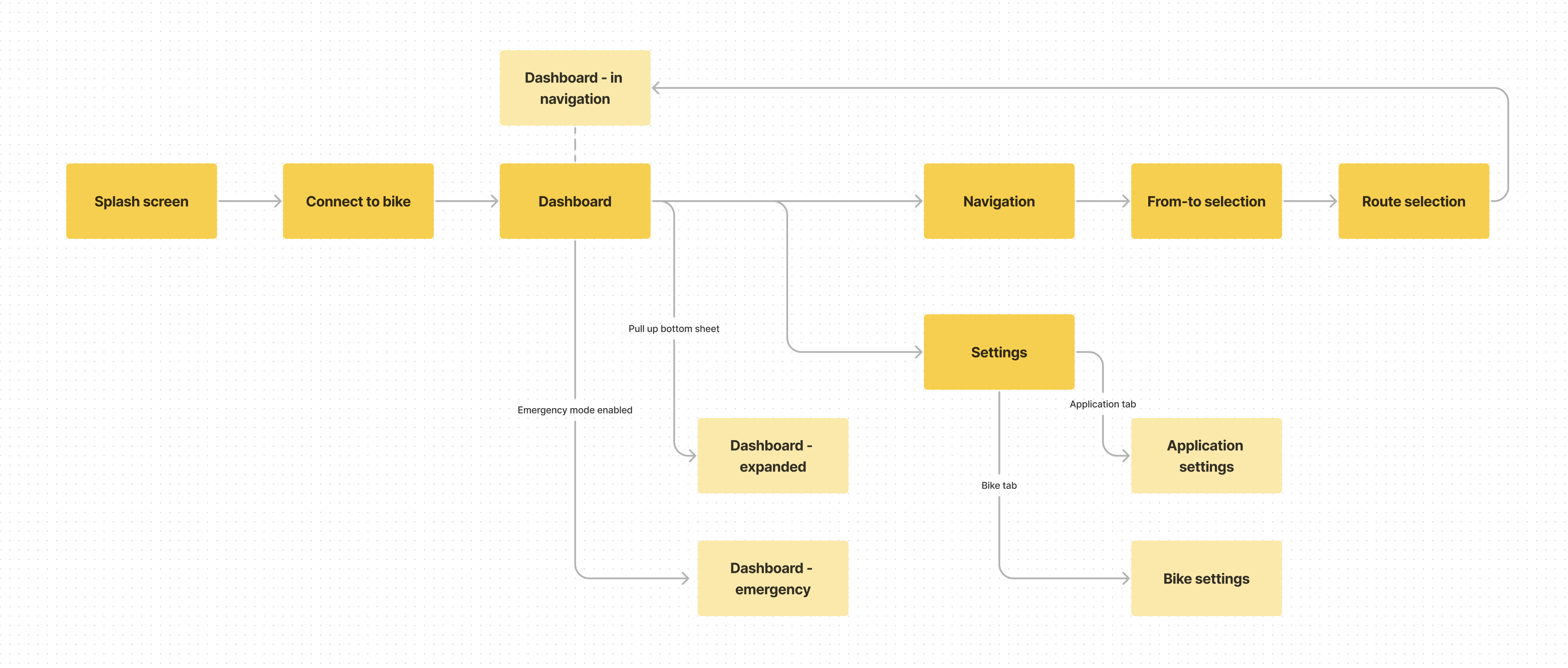
App sitemap - Click to view in fullscreen
Wireframes
Finally, we are seeing the app for the first time! It's nice to see abstract ideas starts to develop into reality, doesn't it? ;)
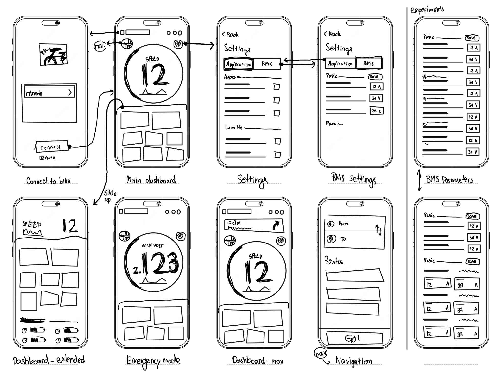
Design Wireframe (unwired interactions) - Click to view in fullscreen
Additionally, after gathering initial feedback, they can be similar concluded as follow:
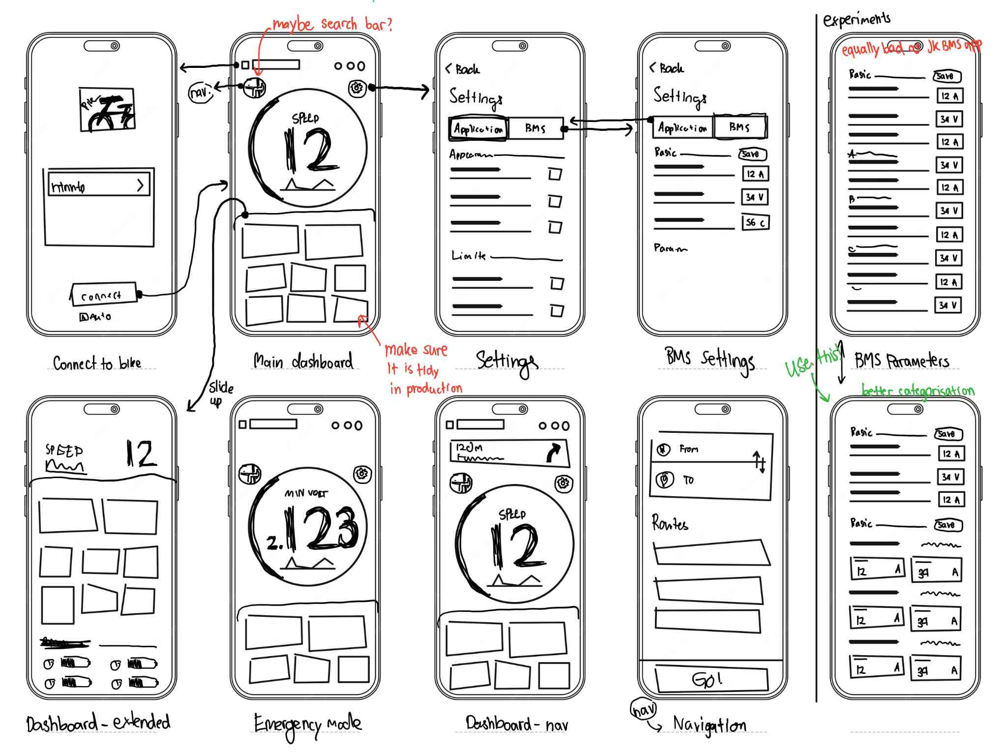
Design Wireframe (with additional comments from testing) - Click to view in fullscreen
A little UI sneak peek!
The UI design stage is being completed as you are reading this. Here is the exclusive sneak peek of the UI designs.
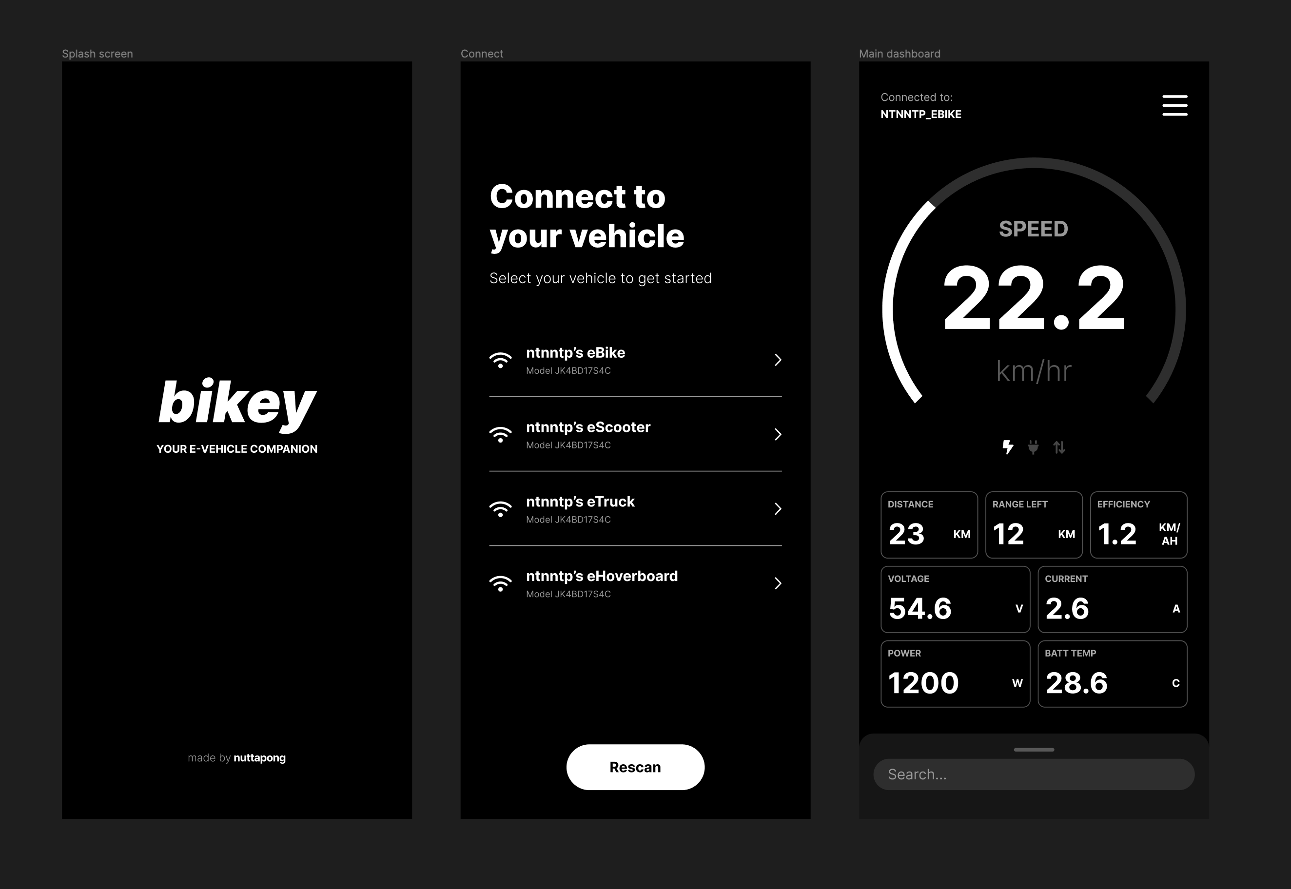
Hi-fi prototypes
The high fidelity prototypes will be designed, with interactions linked between frames to ensure seamless testing in next stage
Testing
Usability testing will be conducted to uncover additional insights regarding the design. Once finished, the design is ready to complete its first cycle by going into development and production.
Development
This is very challenging part for me. I have already enrolled courses in Coursera about Swift programming. I will try my best to learn the iOS development and develop this application on my own.