LINE MAN Messenger Redesign
LINE MAN Wongnai, 2022
Redesign Messenger service in LINE MAN application to both improve user experience and accommodate future functionalities.
LINE MAN Messenger Redesign
LINE MAN Wongnai, 2022
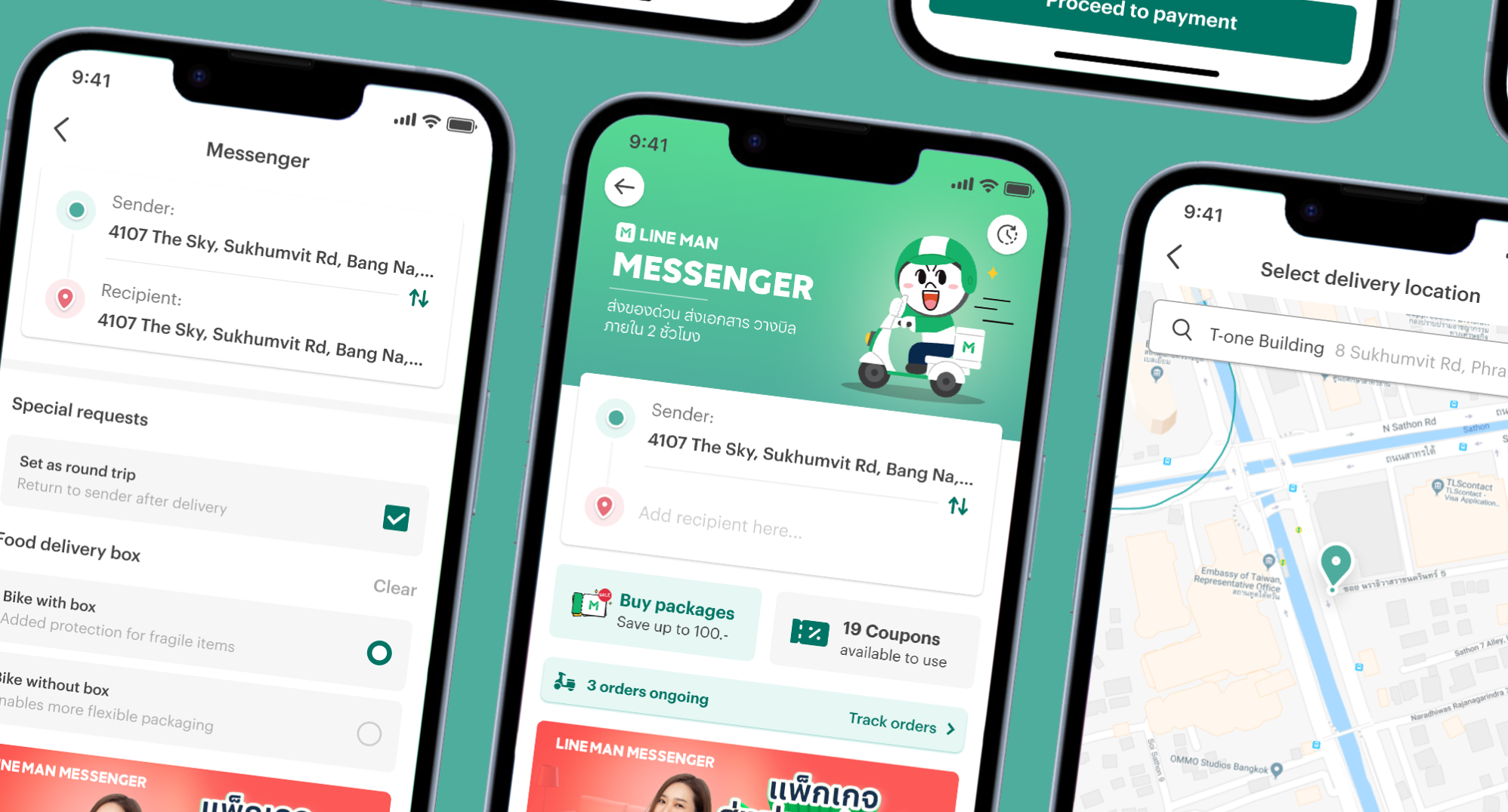
Lifeless design, now alive
With outdated user interface, frustrating user experience, and lacklustre features, the LINE MAN Messenger service is in desperate need of a redesign.
What is "LINE MAN Messenger"
LINE MAN Messenger is a service within the LINE MAN app that enables users to deliver parcel instantly. At the moment, the service is limited to delivery by motorbike. Compared to other delivery options, LINE MAN Messenger offers relatively affordable prices and also provides delivery insurance that covers up to 3,000 THB.
Scope of the project
This project is aimed to do the "initial redesign" of the LINE MAN Messenger user interface and user experience. While many pages of the service will be updated to new appearances, no new features will be added. The team may discuss new features but likely won't implement them yet as those features will be added in later phases (outside the scope of this project).
Project statusIn production
The redesign was finished in July 2022 and passed to senior team members for further review and refinement. Currently, the updated design was integrated into the LINE MAN app version 12.0.0, which was released in September 2022.
Okay. What's the situation?
LINE MAN Messenger is a service that has not been updated since its launch, unlike other LINE services like LINE MAN Food and Mart that have undergone significant improvements over the years. As a result, LINE MAN Messenger users have been experiencing poor user experience and unexciting user interfaces, which made them switch to competitor apps instead.
Before all else...
What does the LINE MAN Messenger user really need? Modernised user interface? More features? Promotions and discounts? Fortunately, the product management team already did a preliminary research and found that users prioritised more on better product and service above all else.
So what I need to do is make the product better, but how?
Insights, from real users
In an interview with an ice cream seller who primarily uses GrabExpress, we gained valuable insights into LINE MAN's main competitor. These insights will inform our approach to improving our Messenger service for instant deliveries.
Messenger requires more steps to show price estimate compared to GrabExpress.
Many users are still willing to pay more if it means better product and service for them.
Most map providers are not completely accurate with address numbers. This left sellers with inconvenient process of manually confirming with their customers.
Lack of order management and difficulties with price acquisition make Messenger unfit for business users seeking speed and convenience.
Inspect to improve
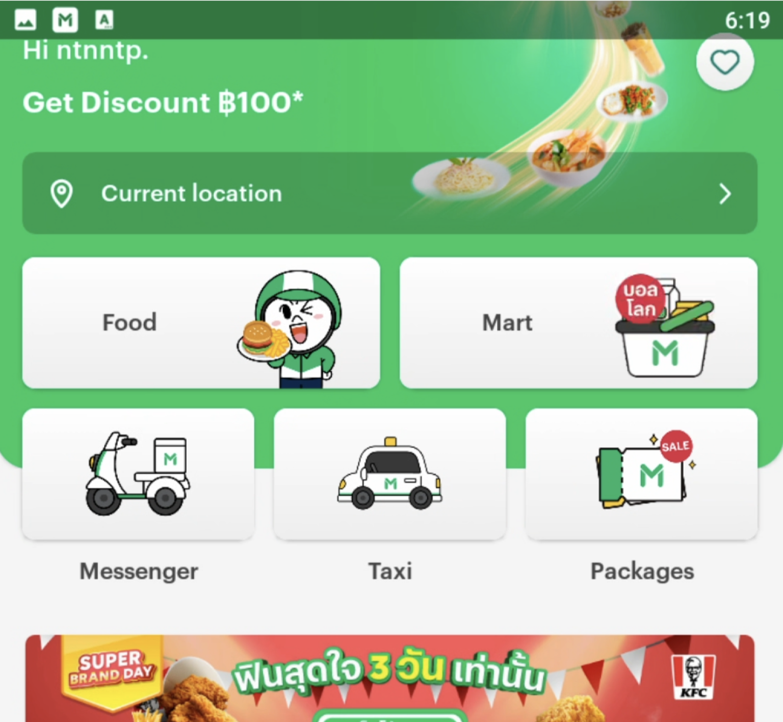
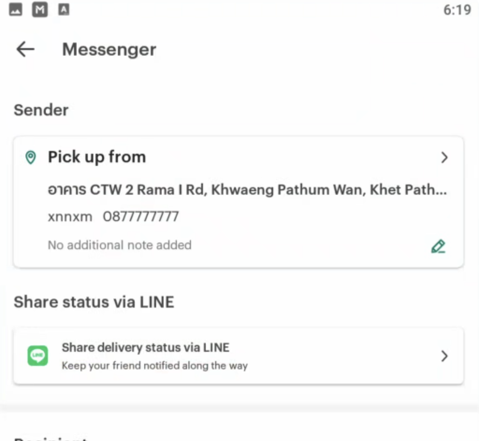
Upon opening the app, users are greeted with an inviting and colorful interface, featuring icon-based designs. But once they access the Messenger service, the experience becomes dull and lacks visual appeal.
Also, Messenger's user experience is complicated, even for simple tasks like getting delivery prices. Users will need to go through multiple steps just to select a destination and even more to see delivery cost.
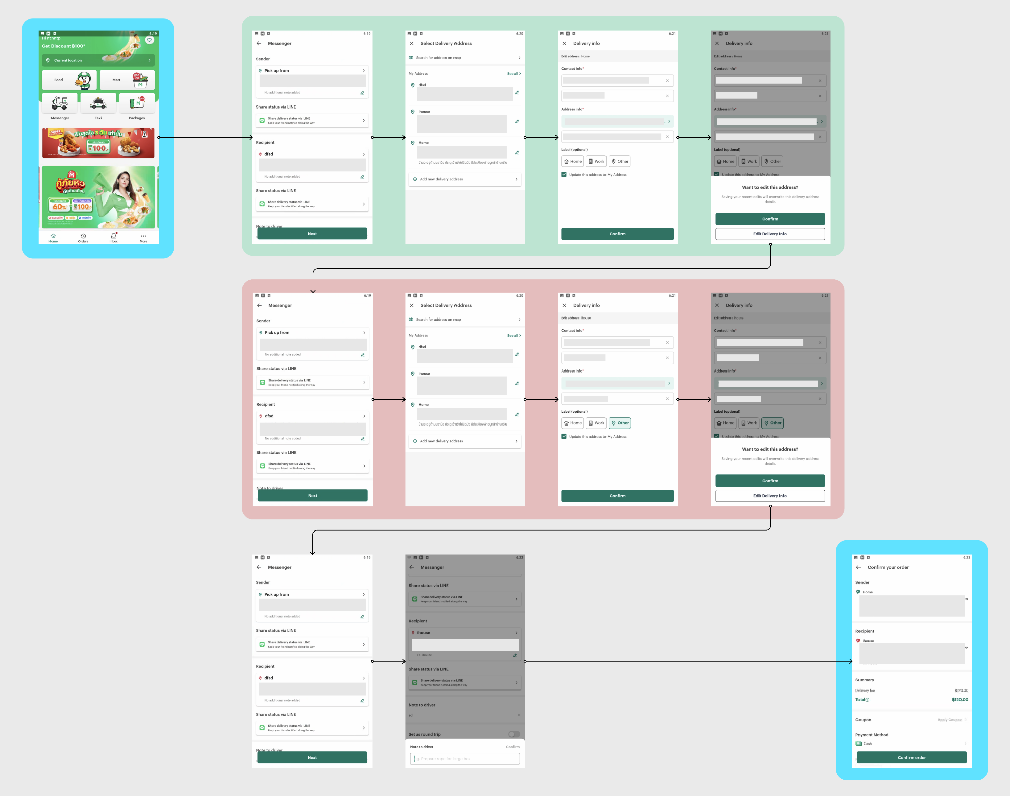
The flow above is the flow of LINE MAN Messenger users trying to see the delivery prices. Mind you, this user is selecting locations from their saved addresses in their LINE MAN address book and it still takes 11 steps in before getting delivery prices!
Then... what's the impact?
"Using LINE MAN Messenger is really a hassle"
— from ice-cream merchant interview
Of course. That.
Everyone loves easy-to-use products, but that wasn't the case for LINE MAN Messenger. No doubt with users choosing competitor’s service, specifically GrabExpress and Lalamove, even if it means paying a bit more.
Learn from the competitor
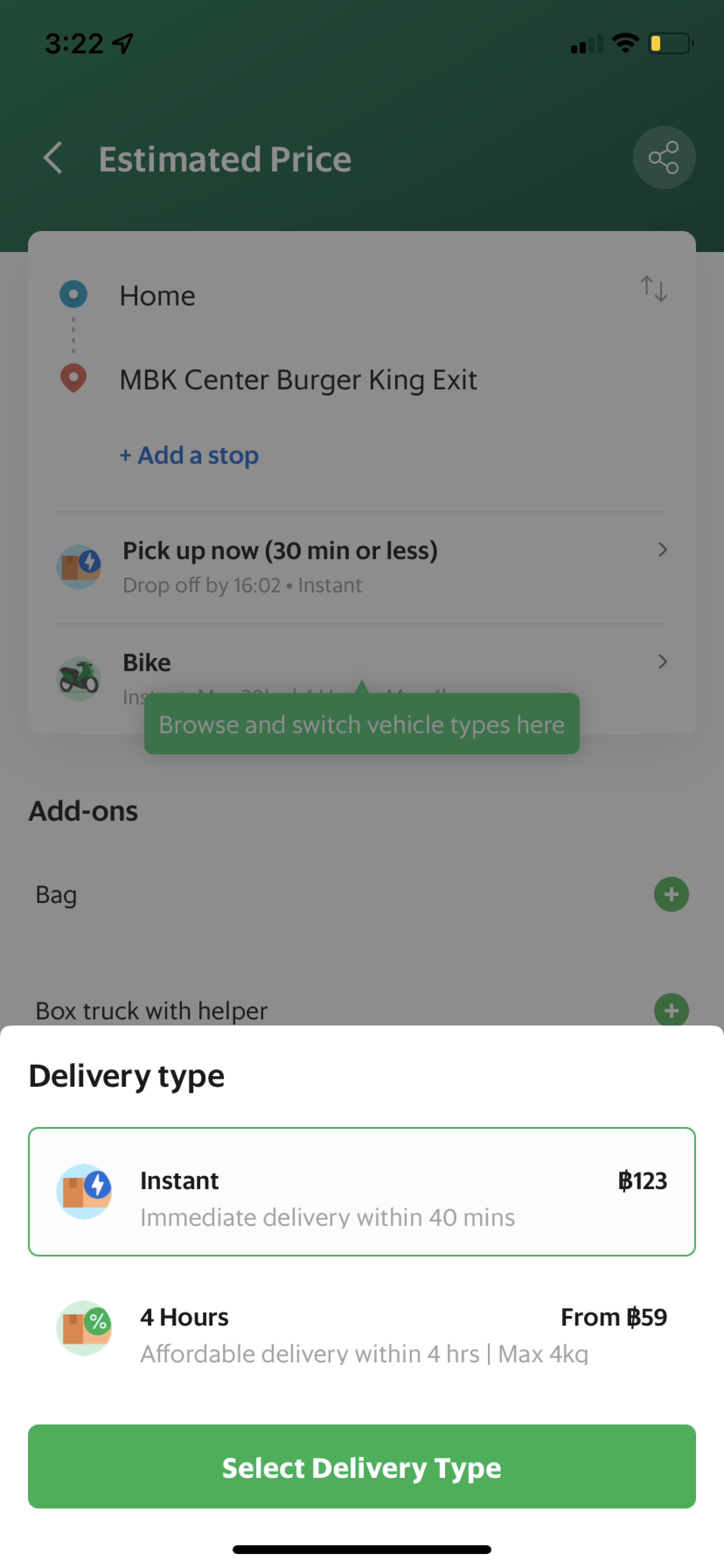
We have explored many messenger services including Lalamove, Skootar, Deliveroo, and GrabExpress, but GrabExpress has piqued our interest the most due to its considerably the best look and feel among others. Here are some points we have considered.
Get estimated delivery cost faster
GrabExpress beats LINE MAN Messenger in showing delivery cost estimates. GrabExpress shows the cost instantly after selecting a saved location, while LINE MAN Messenger requires multiple steps before displaying the cost on the confirmation page.
Modernised User Interface
LINE MAN Messenger has a bland design compared to GrabExpress, which has a lively and organized interface. GrabExpress also utilizes icons for both visual aids and aesthetic appeal.
Better Information Architecture
GrabExpress has a well-organised information architecture, making it easy to navigate despite having more features than LINE MAN Messenger.
More options and features
While LINE MAN Messenger only has the round trip feature, GrabExpress offers more flexible delivery options than LINE MAN Messenger, including round trips, scheduled delivery, 4-hour delivery, and multiple stops. These provide users with added convenience.
Keywords. Summarised
In short, this is what our new redesign mainly need:
Fast doesn’t only mean the loading times need to be minimal. In fact, the “fast” here is actually in terms of usability. We need to take our users to their goal as fast and smooth as possible.
Our application need to streamline tedious tasks such as address filling, to minimise effort for the user and make their experience as efficient as possible.
The LINE MAN Messenger is constantly evolving with new features on the horizon. Our major revamp will prioritise a flexible design foundation to seamlessly support future additions.
As original interfaces has several things missing, specifically tracking and order history. The new redesign must include that as well.
Prioritising things
UI Redesign
In a delivery app like LINE MAN Messenger, the most important aspect is addresses. To ensure a smooth user experience, the sender and recipient location fields should be emphasised on relevant screens. However, in the current design, these location buttons are styled similarly to the "Share delivery status via LINE" button.
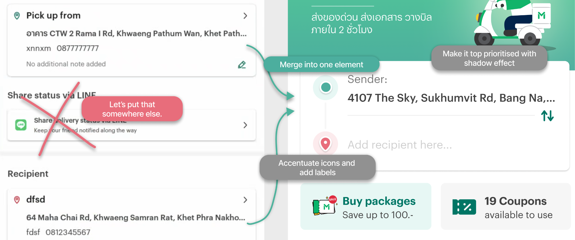
To better visualise the delivery process, these fields could be connected with dotted lines or merged into one element with two inputs. In this topic, an A/B testing is conducted internally, with selected choice being both locations merged into one element (and the lines connecting between two inputs as a second choice).
Icons can also be used to provide visual aid, while important elements such as the location selector should include explicit instructions to guide the user.
Reunite with other services
UI Redesign
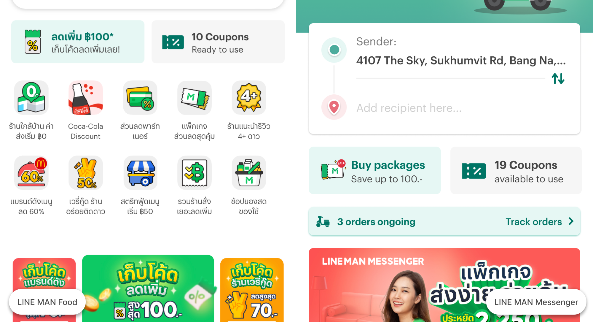
As a sub-service in the LINE MAN app, it's important for Messenger to align its interface design with other services such as LINE MAN Food or Mart for a cohesive user experience. Fortunately, LINE MAN has its own improved design systems, so implementation is the only remaining step.
Spaces for marketing
UI Redesign
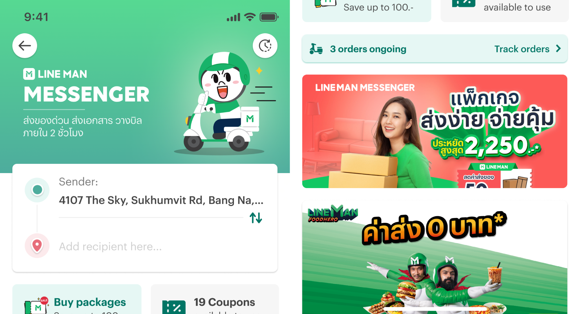
Finally, Messenger currently only displays advertisements through pop-up notifications from Leanplum. To inform users about packages and promotions, graphical banners should also be added to the main Messenger interface.
We tried placing in the header, after key elements, and on the confirmation page as a final promotion call. After testing, these all placements worked without hindering the functionality of the service. Still, we need to have the header as a static Messenger banner and others as a dynamic (remotely updated) banners as the header will affect the overall appearance of the UI most.
Also, the banners should not be too distracting or intrusive. The priority of the redesign is to improve usability and satisfy users, who value better products over promotions and discounts.
Help users do things
UX Optimisation
The key elements of a Messenger delivery app are inputting addresses, adding options, reviewing orders, and tracking delivery progress. To ensure speed, the app should default to the last used location for senders, allowing them to simply select the recipient location and move on.

Next, users will be automatically taken to the next screen. They can now see an estimate of the delivery cost with different options to choose from like round trips and vehicle types. And in the future, users will have the added benefits of extra insurance and faster delivery options so they can have more accurate estimation of the delivery prices.
In the next step of the ordering process, users will enter essential delivery information, such as delivery location and selected extras. Messenger will then provide a summary of the inputted information for review. Once all information is confirmed and payment is selected, the ordering process is complete. Users can then track the rider's location and await their delivery.
In the delivery tracking screen, they will be able to share delivery progress via unique URL. As this feature is the second priority of this project, it will be explained later on.
Improved location pinning
Future improvements
Well, currently pinning accurate location is... painful (pun intended)
Yes, pinning location is easy; but making it error-free is just cumbersome. To enable users more fluid experience, we will need some solutions for this challenge.
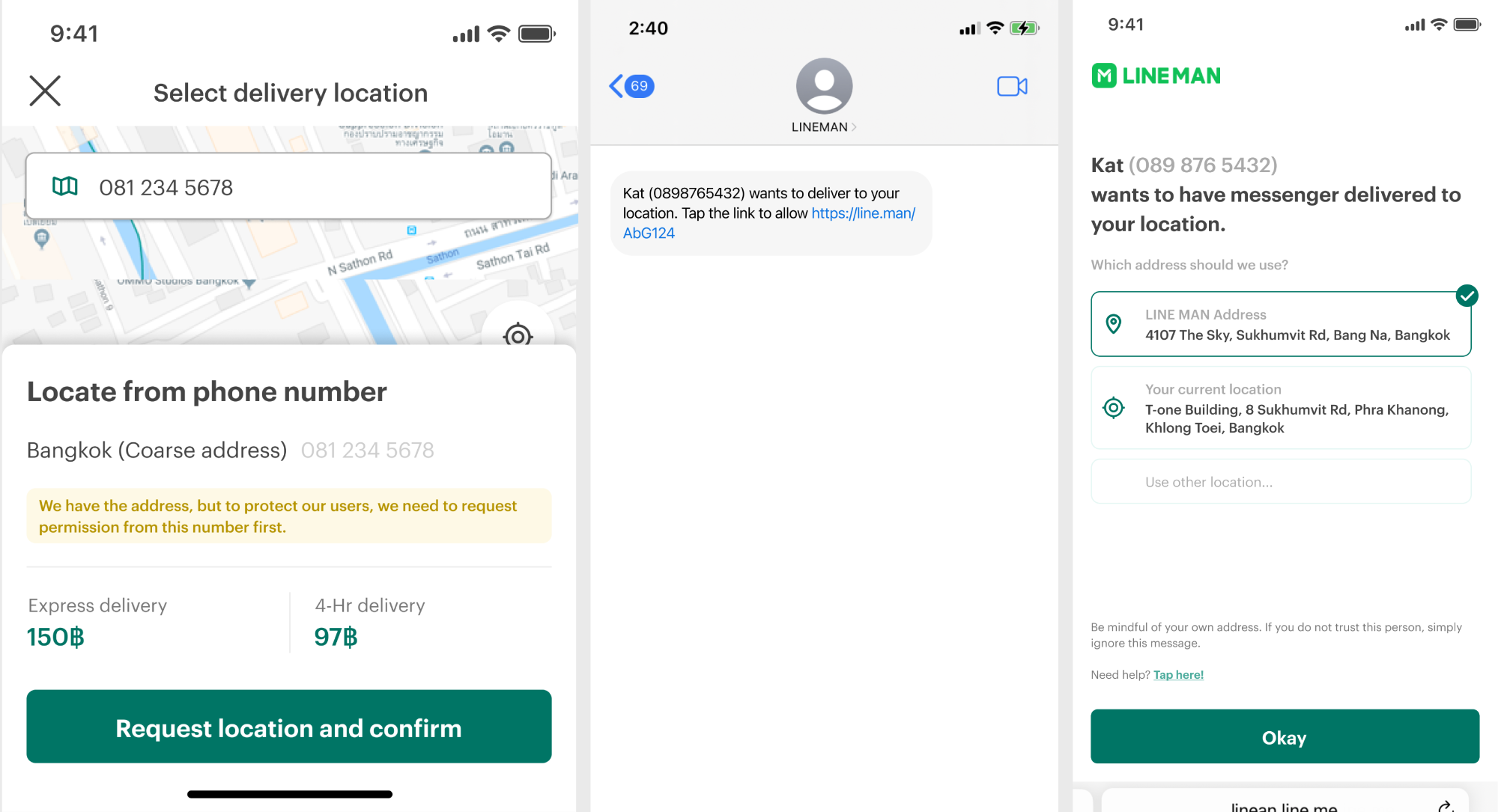
The "get address by phone number" feature streamlines the delivery process by allowing users to enter recipient's (or sender's) mobile phone number instead of manually entering their address. However, it's important to consider privacy concerns, as users may have multiple saved addresses in their address book and there may be potential for misuse if safeguards are not in place.
To address that, we will need to make a request from another users. The user receiving the delivery will receive a notification on their phone to verify and select their saved address or add a new one. Once verified, the order creator will receive a notification. For Messenger users without the LINE MAN app, a unique webpage (like the one above) can be used to confirm their preferred location. The order creator will be notified once confirmed.

The LINE MAN app should provide suggestion to users in “Select delivery location” page and let users input location URLs from Apple Maps or Google Maps for added convenience. However, due to development limitations and potential iOS 16 clipboard permission prompts, users may need to manually paste location URLs instead of typing in addresses to find their destination.
Sharing delivery status
Future improvements
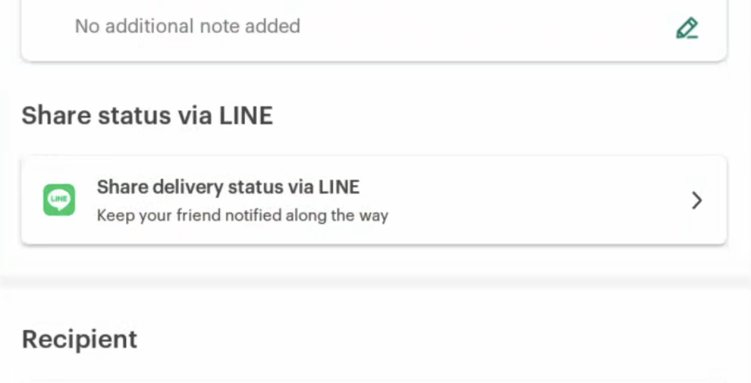
The "Share status via LINE" feature may seem useful, but it's not a priority for most users. In fact, this is one of the reasons why Messenger is not ideal for business use. Orders can be placed outside the LINE platform, such as on Instagram, TikTok, Facebook pages, etc., which means there is no LINE contact to share the tracking status with, making the feature redundant.
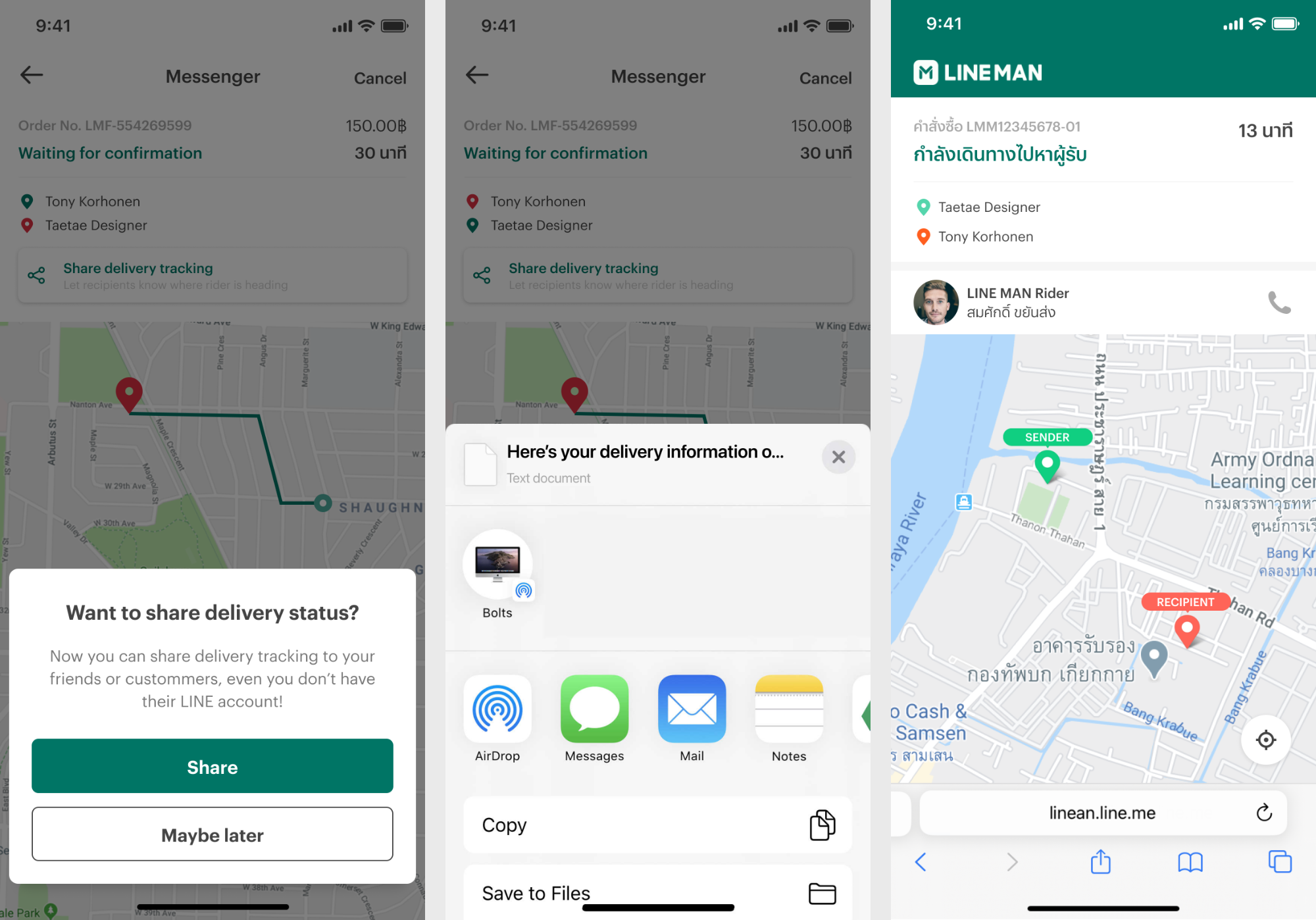
To expand the functionality of "Share status via LINE," a practical solution is a shareable delivery tracking link accessible from both the LINE MAN app and browser. But implementing multiple delivery stops will definitely raises privacy and map display questions. This will require further exploration for a viable solution for this matter.
Prototype
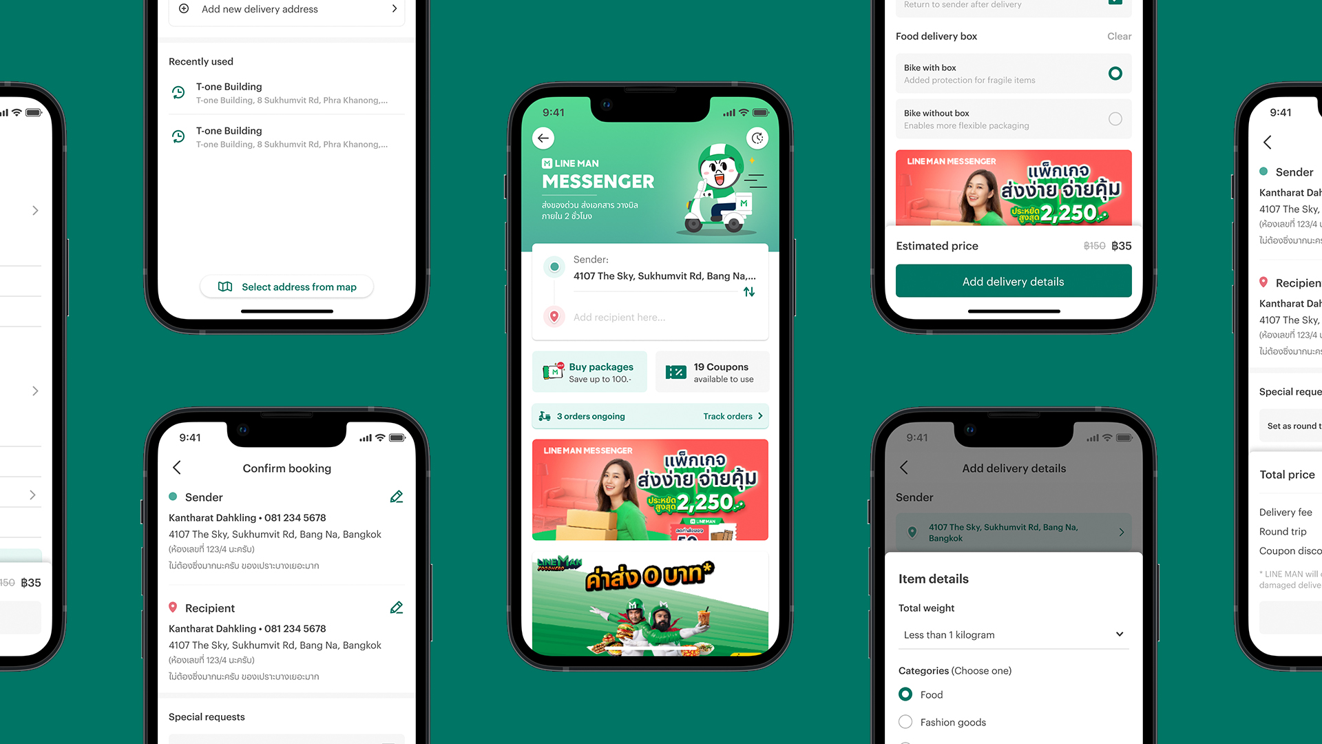
The prototype of LINE MAN Messenger was designed using Figma.
To view the interactive prototype in Figma, view the website in larger screens or click here!
User flow
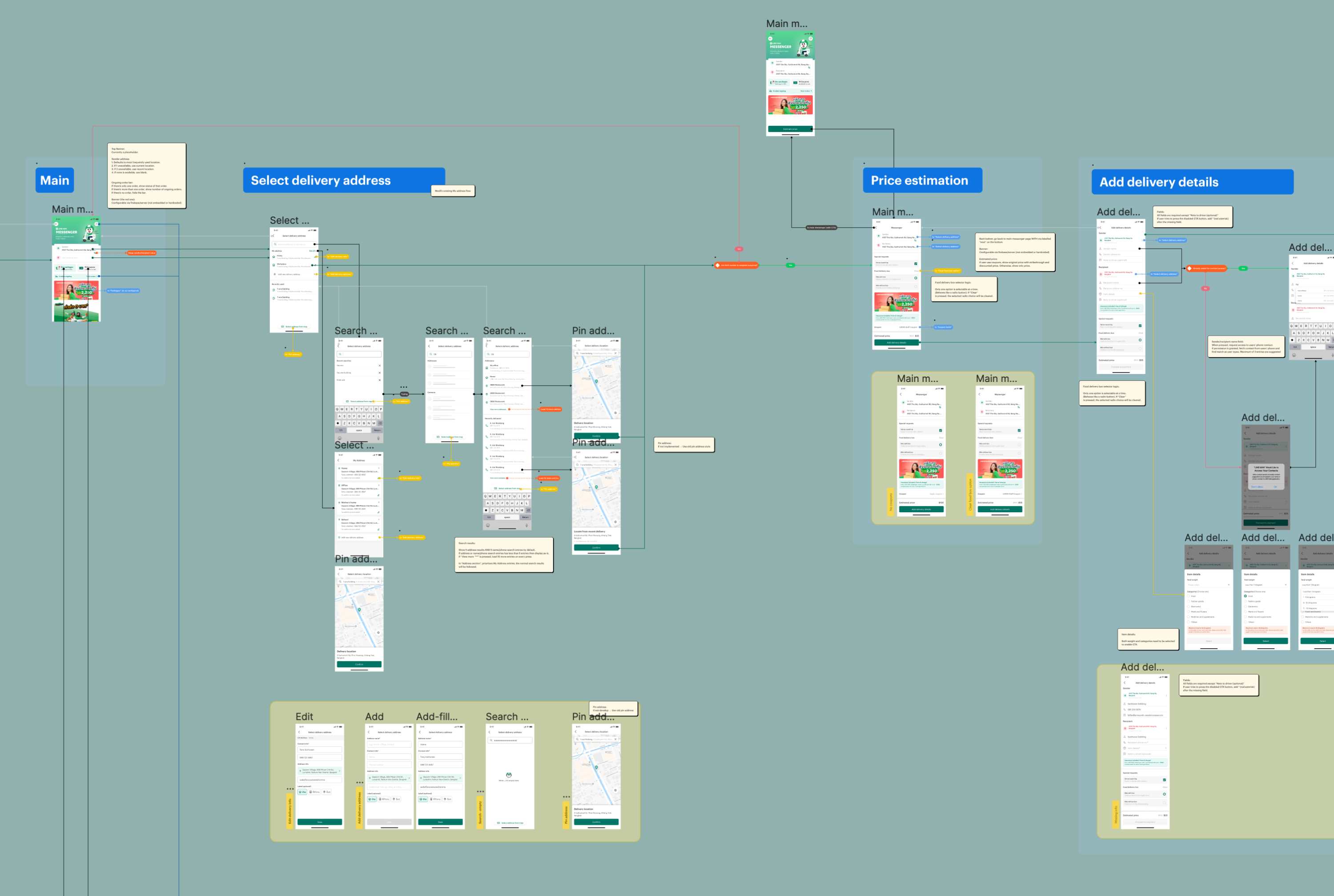
The user flow of LINE MAN Messenger was made using Figma.
To view the user flow in Figma, view the website in larger screens or click here!
Project status & outcomes
The first phase of the Messenger redesign, focusing on improved flow and user interface, has been completed and handed over to senior designers for refinement. Despite some modifications, the core designs have been implemented and the new LINE MAN Messenger has been in production since October, 2022. Future phases with added features and enhancements, such as delivery tracking sharing and forms, may be implemented in the coming months.
Key design updates
Refreshed appearance
LINE MAN Messenger has now been updated with new visuals to match with other services such as LINE MAN Food and LINE MAN Mart. Elements are updated to match the revamped design system as well.
Streamlined experience
Messenger is now faster and easier to use, solving key pain points of convoluted user flow.
The must-have is now here
The new redesign also include ongoing order tracking as well as swappable sender-recipient location.
Simplified
Now, users can fill in their information within the same page and able to review the inputted information quickly and efficiently.
Stay informative
While unnecessary information are trimmed out, most of the crucial information that users will need is there. This includes the location notes, which might look like a "Note to driver", but actually has different information and purpose.
Colour hints
Sender and recipient locations are now displayed in turquoise and red colour accordingly to distinct these elements from the rest of input fields.
Intense internship
During my two-month internship at LINE MAN Wongnai, I was tasked with redesigning the Messenger service with added features, a high-impact project I specifically requested. Despite the challenging nature of the project, I was thrilled to be a part of it and gained valuable design skills. This internship has been an incredible learning experience.
Win-win situation
During a presentation to the marketing team, they requested ad banners on top of most screens, which would push crucial UI elements out of view and increase friction. I quickly created a simulation of the screen area to demonstrate the visibility issues. After collaborating with the team, we found a solution by having half of the banner displayed and moving the read-only information message to the bottom, ensuring visibility of crucial elements, easy access to the information message, and sufficient exposure for marketing.
As a UX/UI designer, user satisfaction is always top priority. In meetings with other departments, I need to find solutions that balance user experience with their interests, but if necessary, I will defend my designs to ensure users are happy and their needs are met.
Information architecture first
In the confirmation page, I faced the challenge of displaying a lot of information, including addresses, add-ons, payment options, and banners. My initial thought was to order the sections as "addresses, payment, add-ons" for ease of use and relevancy, but after re-evaluating and consulting with senior designers, I realised that putting the payment section at the bottom, even if it requires scrolling, provided a smoother information flow and reduced confusion for users. This experience taught me the importance of prioritising information architecture in my designs.
Be creative and re-iterate
In my previous work as a UX/UI designer, I used to follow the conventional approach of maintaining user familiarity and sticking to earlier designs. However, during my internship at LINE MAN Wongnai, I learned the value of starting from scratch and exploring creativity in redesigning products. By listing down assets and features, I am now able to create designs that are not limited by previous constraints, just like drawing on a blank Figma project.