LINE MAN Messenger Interstitial Survey
LINE MAN Wongnai, 2022
Design LINE MAN Interstitial survey to obtain user data for future uses
Messenger
Interstitial Survey
LINE MAN Wongnai, 2022

Make it quick
We hate surveys. It waste our valuable time and takes us away from what we're doing — and I get that. That's why this interstitial survey needs to be easily interact-able, quick, and pleasing so users can continue doing their things quickly and LINE MAN can obtain quality data from the survey.
What is "LINE MAN Messenger"
LINE MAN Messenger is a service within the LINE MAN app that enables users to deliver parcel instantly. At the moment, the service are mainly meant for personal uses. However, a big portion of business users use LINE MAN Messenger to deliver parcels as well.
Scope of the project
This project is aimed to "design" the interstitial survey of LINE MAN Messenger which appears after user launched the Messenger service. The survey will be executed via Leanplum API, and the technical limitations will be considered in the design.
Project statusIn production
The design was finished in July 2022 and passed to senior team members for further review and refinement. Currently, the survey was integrated into the LINE MAN app, which was released in August 2022.
Why survey?
The survey is meant to gather the information of current LINE MAN Messenger users regarding the purpose of their delivery, and items they usually deliver. This is to provide better and more accurate in-app suggestion for them in the future versions of the app as well as providing the marketing department customer insights to come up with the most suitable promotions.
Information to obtain
In this survey, several insights need to be obtained:
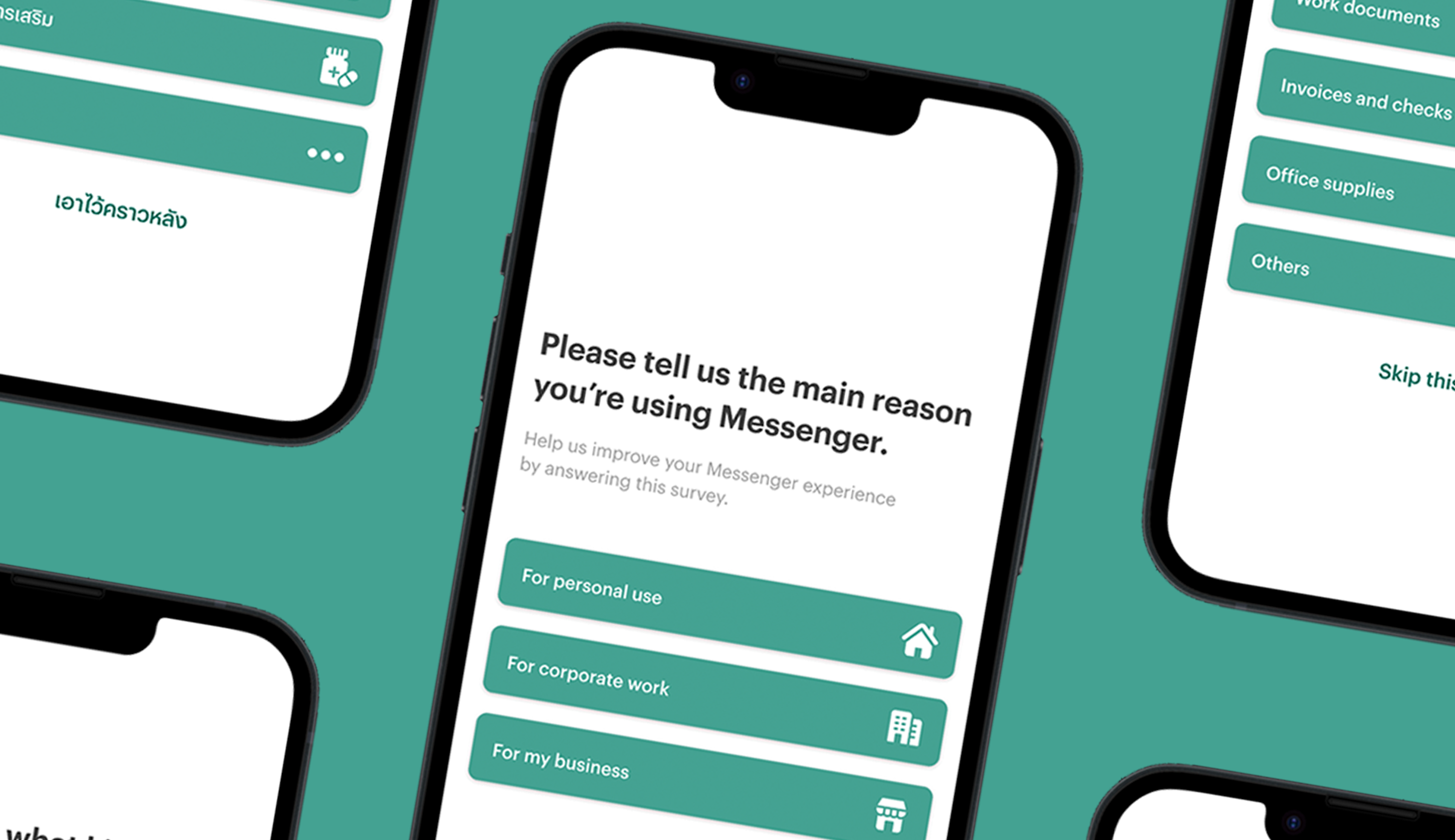
• User type: personal users, corporate (large business) users, or personal (small business) users. This is for future feature improvements and promotions that will be provided to each type of users.
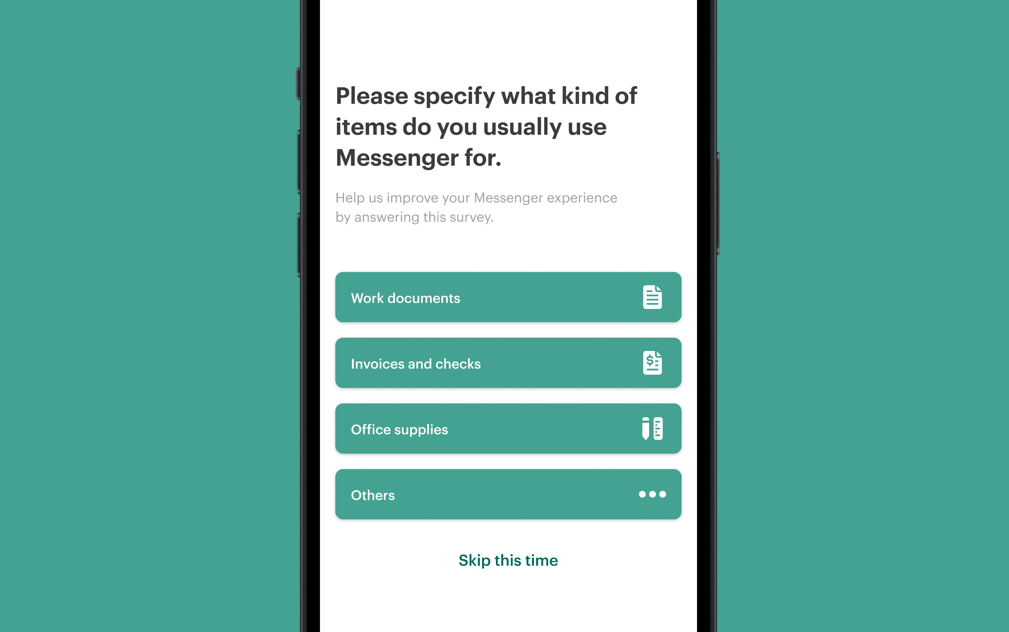
• Items they usually ship: documents, stationery, food, fashion items, gadgets, etc. Choices need to cover most scenarios while not too fine-grained. This is for future service improvements such as 4-hour delivery or shipment with different vehicles.
Users vs surveys
I've looked into the research conducted by SurveyMonkey. They found that 80% of their respondents said the online surveys were annoying in varied extents. According to that, we need the survey process to be as fast as possible, while obtaining usable data to improve the service.
Exchanged efforts
What's the point of doing things with nothing in return, especially answering random in-app surveys like this? There's no point for that!
But if the survey tell them that if they respond to this survey, they get something in return, it's more likely that they are enticed to do the survey. Some online surveys have gone to the solution of giving away money to respondents or grants them to the lucky draw — but for short survey like this, this is not needed.
My solution is to tell them they will get an "improved experience" after completing — and I'm not misleading them either. This information gathered will be used to better provide catered in-app suggestions for them as well as allowing the marketing team to come up with interesting service packages with discounts that will benefit them later.
Technical limitations
As this survey will be implemented via Leanplum API existed in LINE MAN app, there are certain limitations to that.
The main concern is this survey will be implemented as interstitial, appearing right after you enter the LINE MAN Messenger service. Actually, this interstitial is for promotions and advertisements, and is limited to tap interactions only. In other words, this survey will be just an image with a layer of assigned tapping areas on top. Simple, but very limited.
Screen sizes
To make things more challenging, the surveys (or questionnaire images) need to be static and single-sized, meaning that what I designed needs to fit on all screens, from iPhone SE to iPhone Pro Max series and from low-spec Android to full-blown Android with 4K screens.
What I did is I tried experimenting on different screen sizes in Figma and see what works on all sizes of screen.
Designs

The survey graphic was designed using Figma.
To view the interactive prototype in Figma, view the website in larger screens or click here!
Project status & outcomes
The survey design has been completed and handed over to senior designers for additional checks. This survey has gone live and implemented after users clicked on "Messenger" after entering LINE MAN app.
Technical challenges
A fun brain teasers for designers, of course. In this project, I have to find solutions to technical problems such as having no option for users to confirm their choices, or the vastly different display sizes. But in the end, the solutions were found and implemented in my designs.
Make boring things not boring
I must admit that I myself also did not prefer doing online surveys or any in-app survey. Anyway, what I learned from the university courses (it's actually a business writing course but it's adaptable in many aspects of life) is making the listener (or users) feel that they get something in return. I learned the importance of psychology and communication in designing user interfaces and now has put the knowledge to the great use finally.