Magnetolabs Website Design Template
Magnetolabs
Making designer templates and UI components for Magnetolabs
Magnetolabs Template
Magnetolabs
01
summary
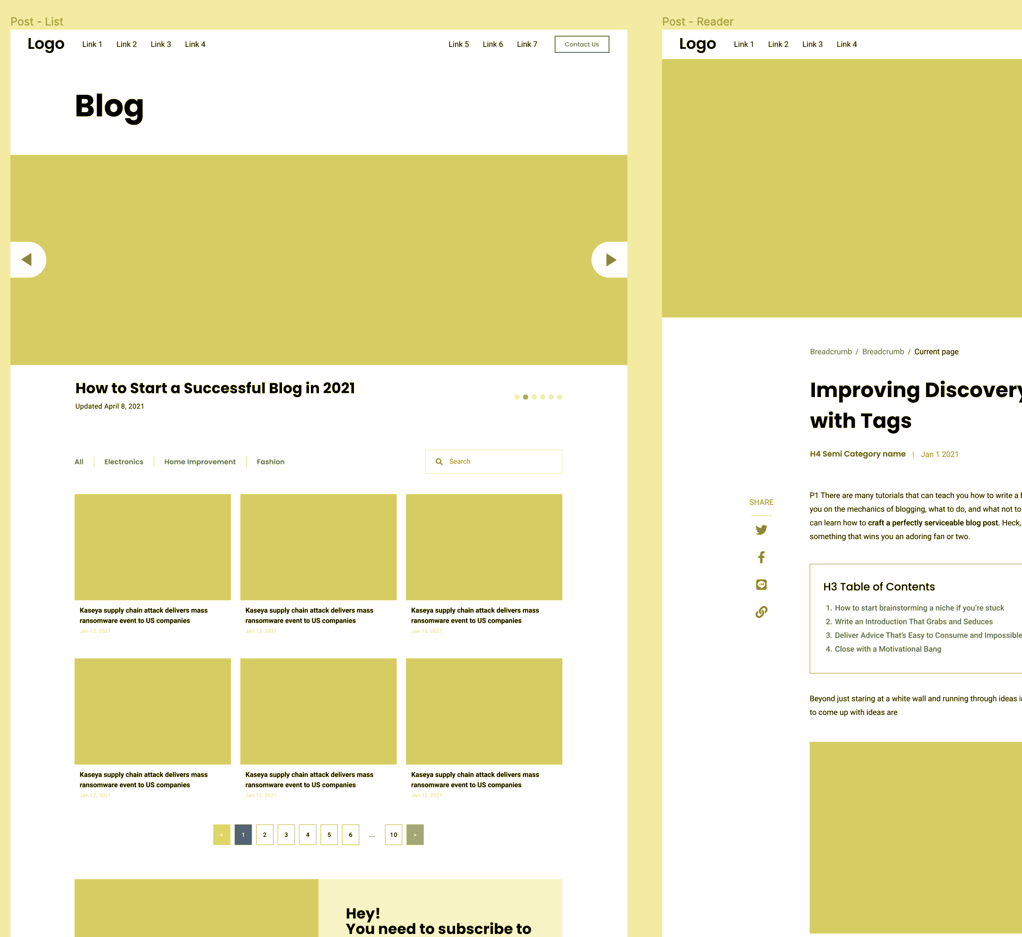
Flexible framework
Designing website from scratch every time will cost a lot of time (and revenue). This template, consisting of pre-made pages, UI elements, and design systems, will speed up the process of website design at Magnetolabs agency.
Scope of the project
This team project is aimed to develop a comprehensive framework for designing websites, including commonly used pages, user interface elements, and design system templates. The framework will be crafted to align with the WordPress CMS platform.
Project statusUtilised
After completing the internship at Magnetolabs in 2021, the project has been handed over to the agency for future uses.
02
Diving in
Team project
In this project, the design team have worked closely with Client Service Director and developers to ensure that the framework will serve maximal benefits as well as achievable in WordPress development.
Previous Magnetolabs designs
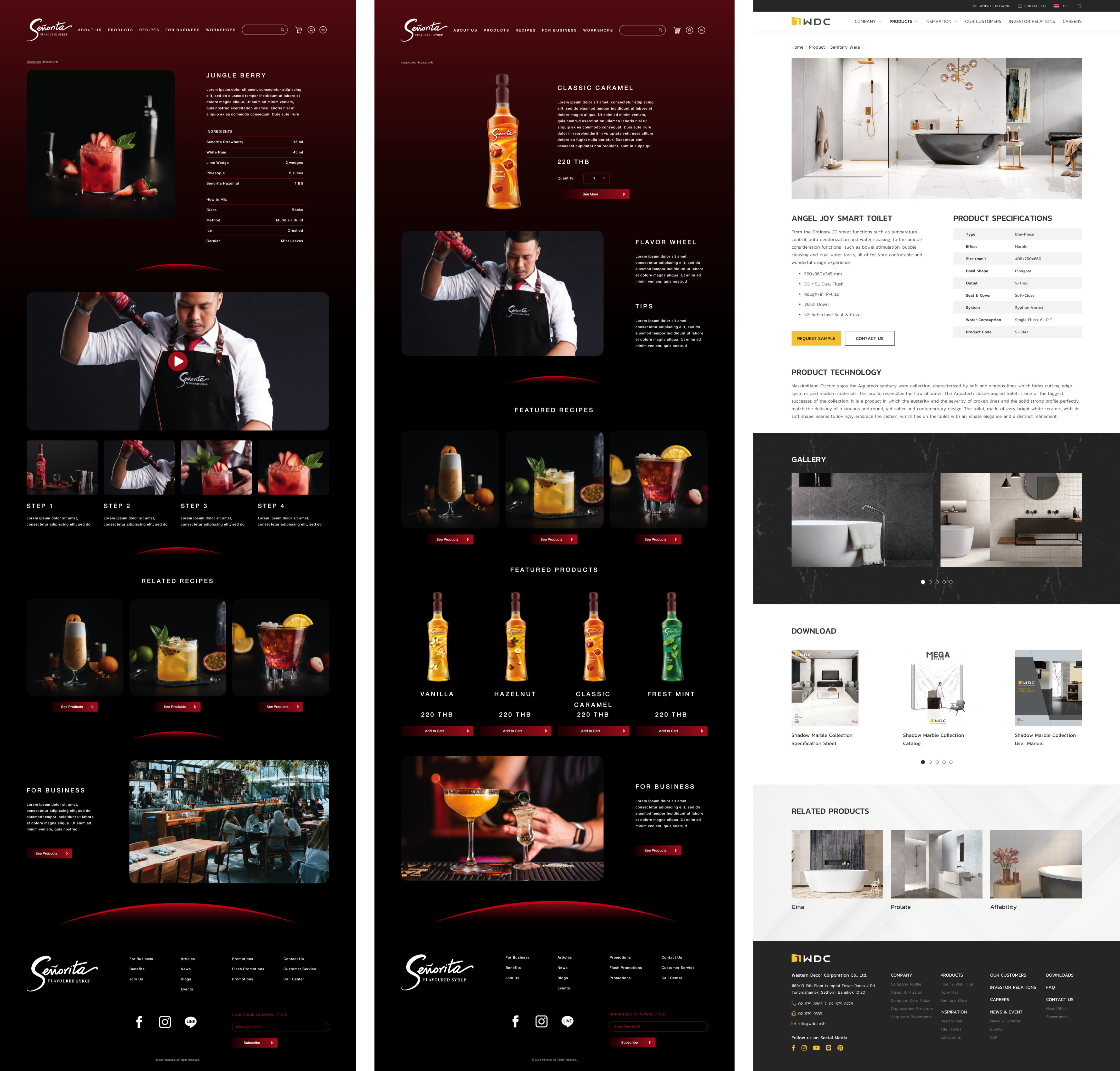
To initially see what is attainable in WordPress, apart from obtaining insights and knowledge from senior developers and WordPress documentations, I have also analysed the previous projects of the agency which are developed using WordPress.
Needed pages
After getting design requirements and data, here are the pages that needed to be created:
Homepage
Highlights of the company
About
Details of the company
Contact
Contact details with forms
Products
List / card view of items
Product Details
Item with commerce & details
Resources
List / card view of items & CTA
Landing page
Multipurpose view with CTA
Misc. page
Multipurpose view
Notices
Plain-text page
Careers
List view of items
Career Forms
Item with details & forms
Blog
List / card view with description
Blog Details
Article with CTA hero
Design objective
And before designing, the objective of this project can be summarised as follow:
03
Results
Design
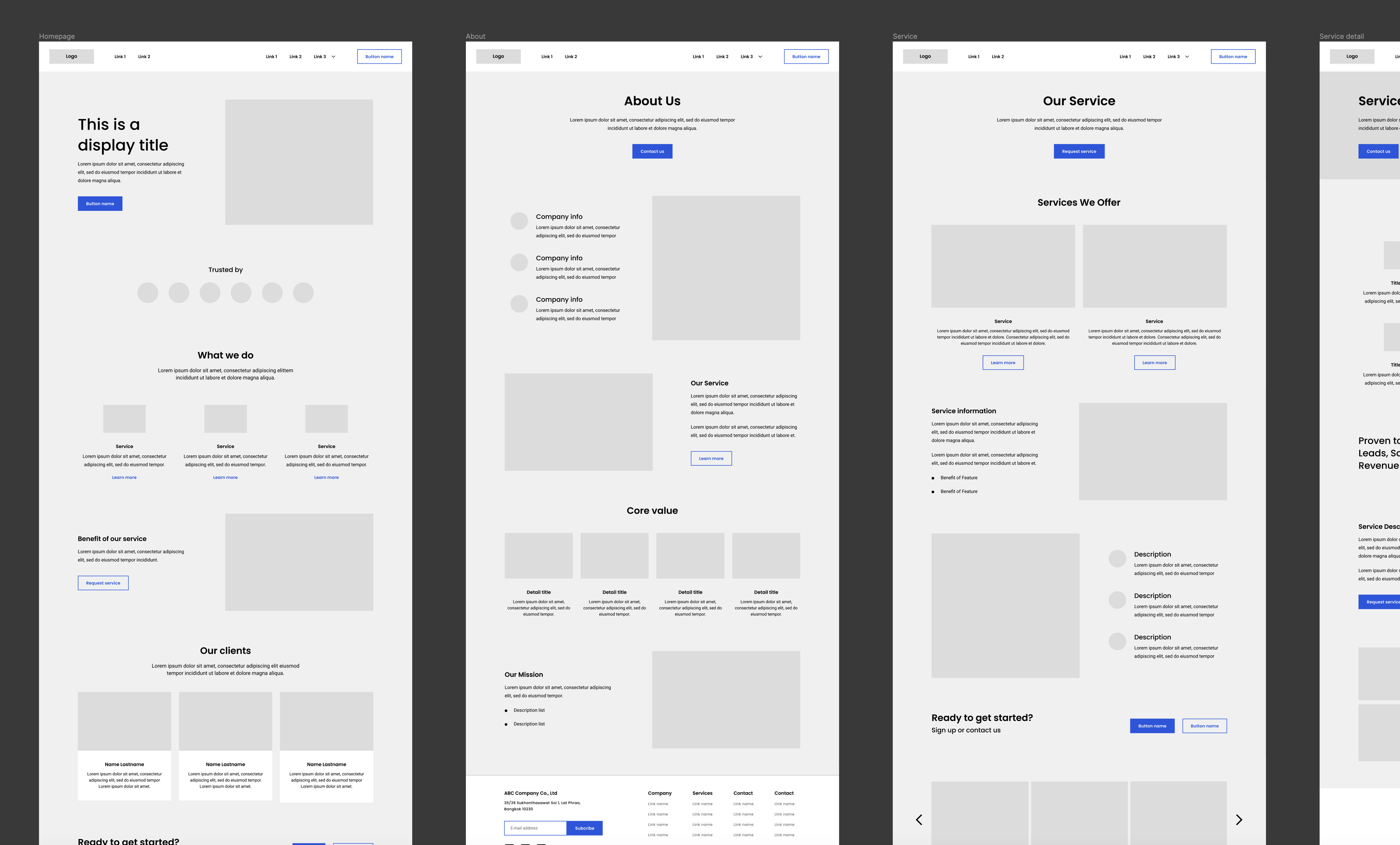
The design of Magnetolabs Template was designed using Figma.
To view the interactive prototype in Figma, view the website in larger screens or click here!
Atom methodologies
The frameworks are designed using atom design methodologies — beginning from the smallest element such as links, text fields, paragraphs, and headings.
These will then form a bigger elements such as input field with labels and buttons and navigation items, which will then later be formed into even bigger elements such as hero banners, navigation bars, forms, article reader, and so much more.
Benefits
Not only using atom methodologies will improve the cohesiveness of the design, but it will also enables easier customisation and flexibility when correctly implemented in Figma. In other words, future designers will be able to configure the templates easily by only changing some properties of the small elements such as colours, fonts, and styles.
Implementation testing
After the template has been created, I then tried using the templates myself. I have created two virtual companies with different design and moods to see if the template is able to shorten the designing time while being flexible.
SECURE Insurance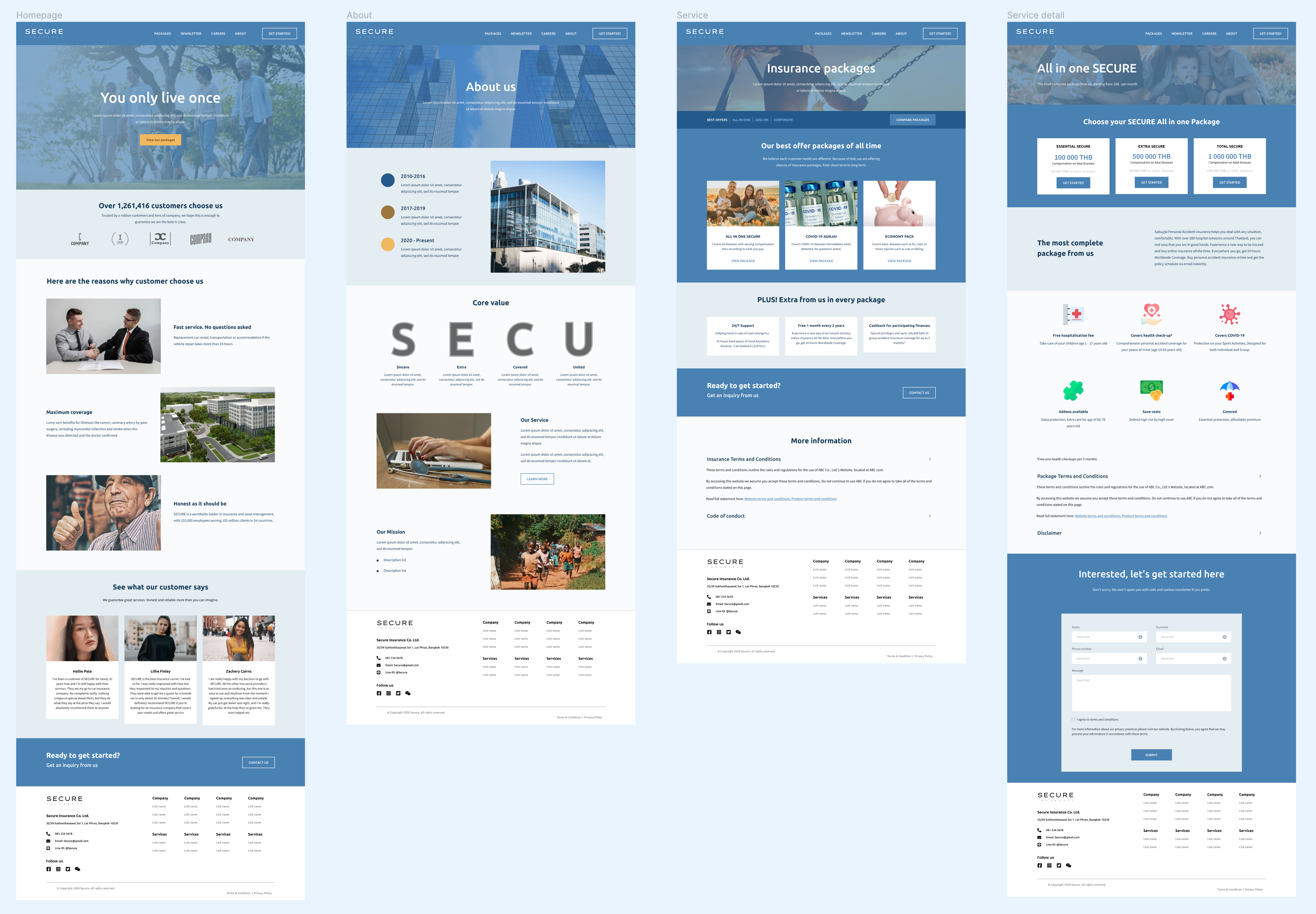 Company keywords: trustworthy, clean, modern, medical
CI colours: Deep Sky Blue
Business sector: InsuranceSweetHouse Residences
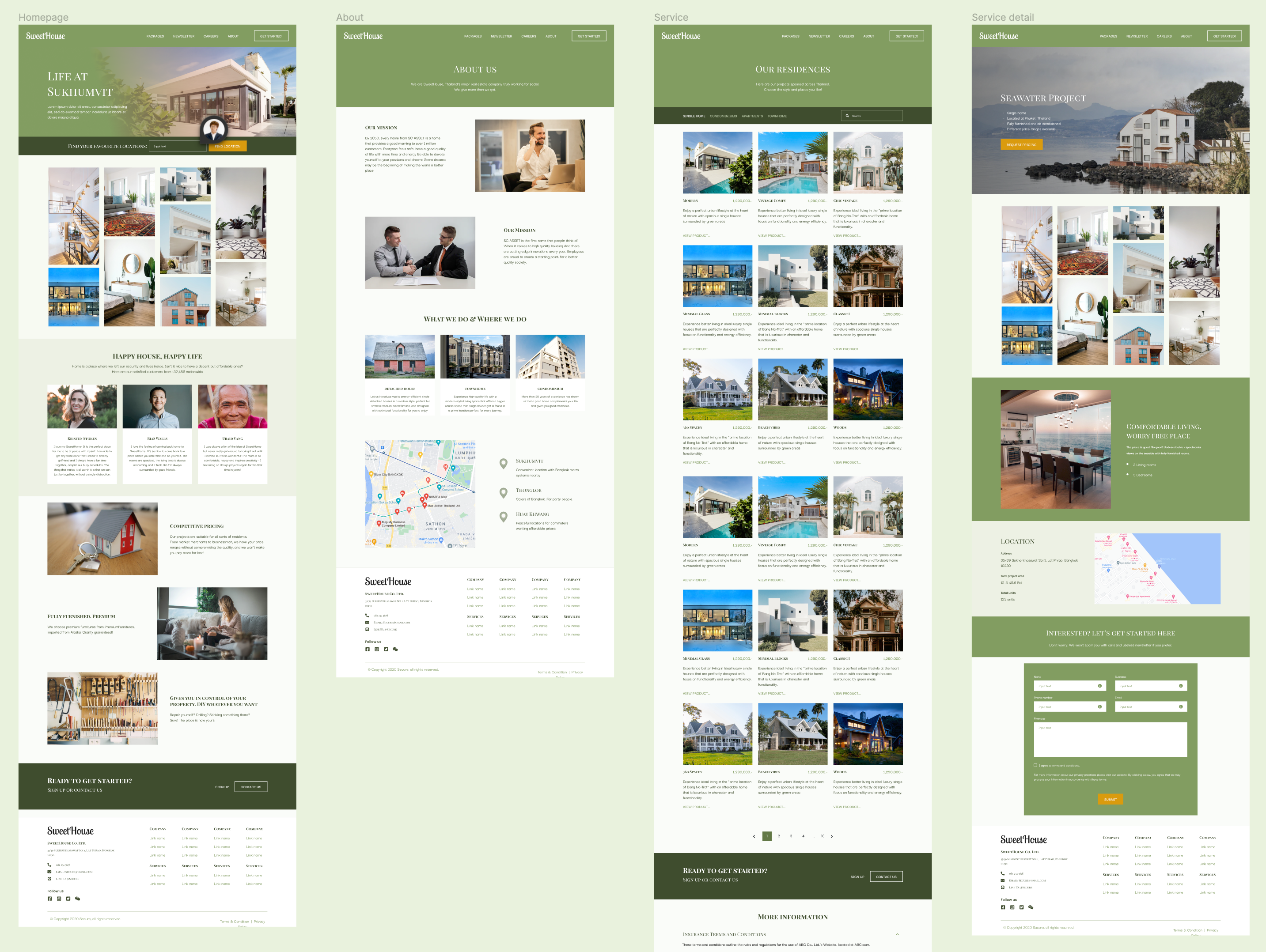 Company keywords: peace, trustworthy, serene, modern, classy
CI colours: Natural Green
Business sector: Residences & real estate
Reduced designing time
Usually, the designing process at Magnetolabs take roughly about 2-3 weeks for the first draft of all pages. When the framework template is implemented in the design process, it has significantly reduce the drafting time to only less than a week.
However, this certainly will not be one-edit-and-done thing. The design framework is meant to serve as a kickstarter for the design draft, and not meant to be a finished product.
04
Reflections
Figma, first time
Before this internship, I've rarely heard about Figma and tried it a few times since the mainstream tools I know can be used to create UI designs are only Adobe XD, Sketch, and InVision. Anyway, after starting the internship, I have been properly introduced to Figma and its advanced functions such as components, variations, auto-layouts, and more. The one thing that wonders me still is unlike Photoshop or Illustrator which have numbers of tools, Figma has less than 10 — how can I create amazing interfaces from that?
But after I used Figma more and more, I realised that all the tools Figma has given me is already enough and quickly become my new favourite versatile design tools.
Balancing everything
Yes, designing user experience and user interfaces are primarily for the users, of course. However, there are other parties and things to consider as well: marketing, financials, SEO concerns, corporate identities, etc. As a result, I have to find a sweet spot that everything in between meets, while prioritising what's best for users.
I cannot change everything
Sometimes, changing simple elements like font weights or colours can affect the whole, not only designs, but the whole organisation. As a designer, things such as bright saturated colours or thin texts might not be very favourable to me, but if it is the core of the organisation already, then the best course of action is to navigate around and solve the problem the other way.
In designing, I'm sure that I will be met with limitations from time to time. As upsetting as it sounds, I actually see these as challenges or brain teasers. Opportunity like this teaches me to think creatively, critically, while staying goal-oriented.