LINE MAN Mystery Meal
LINE MAN Wongnai (Candidate assignment)
Designing new LINE MAN Food feature by using design thinking and data-driven methods.
LINE MAN Mystery Meal
LINE MAN Wongnai
01
summary
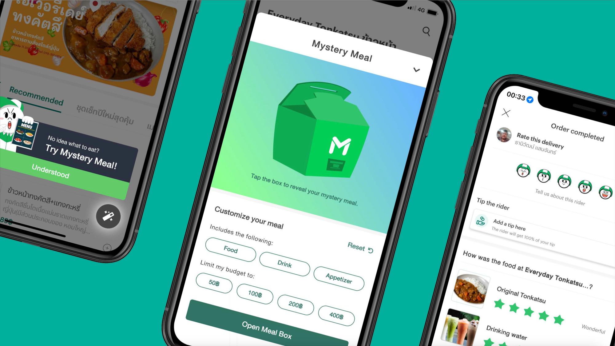
No idea, no problem!
A lot of times we are hungry, but stuck in the indecisiveness of not knowing what to eat, or simply bored of what we have had everyday. Just let this fun LINE MAN Mystery Meal feature choose for you so you can think about other things instead!
Scope of the project
Our goal is to create a new feature for LINE MAN Food that assists users who have trouble deciding on what to eat. This will include adding elements in related screens as well as modifying backend functions, but we're mainly focused on designing a user-friendly interface.
Project statusAccepted
The project is submitted to LINE MAN Wongnai in 2022 as a candidate assignment for LMWN Junior 2022 Programme and has been presented in the candidate interview.
02
Diving in
Before we begin...
First, we need to know our users in order to produce suitable solution.
As per the 2019 LINE Thailand data1 on user demographics for the LINE MAN app, 44% of users are aged between 25-34 years (Generation Y), while 24% are aged 35-44 years, and the remaining 32% are from other age groups.
Regarding each generation's behaviour, their most common trait is a preference for simplicity and convenience. Users from both Generation Y and Z typically value customisation and control2 when making purchases, but they can also be impatient3 . Additionally, Generation Y individuals tend to be strategic and rely on product reviews4 , especially when making a first-time purchase.
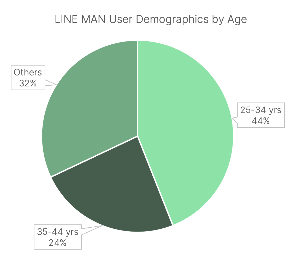
1 Data from THUMBSUP Media | 2 Data from Forbes and Fountainhead |3 Data from Post Today | 4 Data from Business News Daily and Emerald
Empathise & define
Here is the thing: normally, users have their own go-to favourite restaurants, and they have what they want to eat in mind. That’s because the user already tried the meal and know it will be as good as always.
However, the problem arises when our user want to try something new from different places.
"There will be a lot of dishes to try - but which one should I try this time?"
"How can I know if this feature is wonderful or just a gimmick?"
Design objectives
So, what we need to do in this new feature is to...
"Provide users new menu to eat with most satisfactory experience and least effort from them."
and here are what we will need in our new feature:
03
Diving in
Let's wind back a bit
Earlier, we have identified two complications: "what should our users try" and "how to make the choice most satisfiable"
Let's begin with the first one.
Randomisation is the key
How do we make sure our users get the best meal recommendations? Simply suggesting what others have already ordered isn't exciting or helpful. We need a more creative solution - a randomization feature that will suggest what they should eat. Of course, we'll need to use user data to make sure the suggestions satisfy our users.
But let's focus on making the presentation of the randomized meals exciting for now.
Randomisation methods
Mystery box (selected)
Benefits
Trendy
Shortcomings
A bit generic
By now, most people will likely familiar with the concept of mystery boxes (or กล่องสุ่ม in Thai). For this idea, even when the trend's eventual decline, the characteristic of the mystery box itself will remain. Since the process of opening a mystery box is undefined, we can be fully creative: we can make it engaging, sudden, or ideally hit the sweet spot in the middle. Also, the simplicity of the concept allows us to add our own unique features without straying from the core idea.
It is worth noting that before I ended up with this idea, I have explored other randomisation options as well.
Spinning wheel (roulette)
Benefits
Simple and engaging
Shortcomings
Too slow, takes up spaces
Even roulette is a simple and entertaining way to make random selections, it may not be the best choice for our impatient user base. The spinning wheel can take too long to stop, and the limited, predictable menu options take up a lot of space.
Fortune sticks (Seam-Si)
Benefits
Trendy
Shortcomings
Too specific theme
While the trend of spirituality, particularly mu-te-lu (or มูเตลู in Thai), is gaining popularity and resonates with some of our users, it may be more suitable to incorporate this as a seasonal theme, such as during Chinese New Year, for our new feature.
Securing user satisfaction
Great! We now have a solution to our problem "What menu should our users try": Users will be provided a mystery meal feature (similar to the mystery box), which will pick a randomised menu for them.
However, here’s another problem we need to solve: How can we satisfy them by our choice?
Good & bad selections
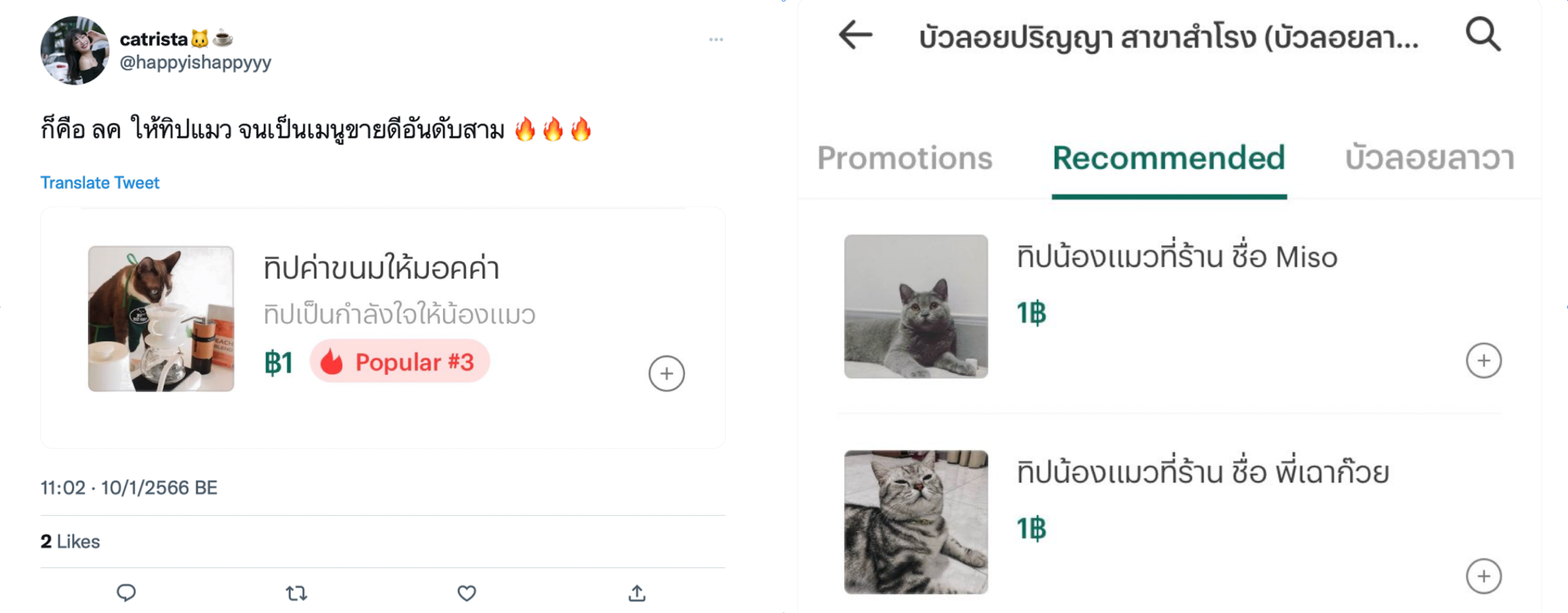
Left: "So lots of customers tipped the cat and the 'menu' is now in #3 popularity", "Snacks tip for Mocha the cat"
Right: Recommended menu - "Tip for Miso the cat", "Tip for Black Jelly"
You might have seen these already...
Although I'm a big fan of cats and dogs, the randomisation algorithm might end up choosing pet-related items as one of the menu choices, which defeats the purpose of the feature that is meant to provide users with food choices.
Furthermore, some restaurants serve both food and drinks, and it's possible that some dishes might not be up to par. Using a simple "pick one" algorithm might result in serving subpar dishes, which could ruin the user experience.
We need a more sophisticated randomisation algorithm to ensure that our users are served the best.
Preferred randomisation
In our randomisation algorithm, we will need it to be somewhat preferable (or biased) in order to provide the most favourable options for users. This can be achieved by using information from LINE MAN database as well as user-selected preferences as inputs for our algorithm.
Client-side: User-selected preferences
To avoid drinks being selected as the user's meal, food will only be chosen if no user input is given. However, users can still customize their meal with food, drinks, appetizers, or all options, along with a price range selector. If no price range is chosen, it defaults to unlimited, as it restricts random menu choices. These features offer customization without compromising the mystery box's essence and randomness.
Server-side: LINE MAN Database
To ensure user satisfaction on the LINE MAN app, we'll only include the must-try dishes from each restaurant in the randomization algorithm. As there is no menu rating system, we'll use order amount to initially rate dishes and categorize consumable vs. non-consumable items based on price.The top 15 most ordered items will be included in the algorithm, and if users are unsatisfied and open the mystery box again, the list will be replenished with dishes from lower ranks. The algorithm will also consider past orders and give less chance of winning to already ordered meals.
Building food database
Users will receive a notification to rate their meal and ordering experience on a 1-5 star scale 30 minutes after completing their order. If they accidentally close the rating screen or finish their meal early, they can access the interface through their completed order history.The meal rating creates a rating database for each menu and provides more accurate data than order amount. When the database is robust enough, the star rating will be used to incorporate menu selection. The ordering experience rating allows users to provide feedback on new features and the application itself
Merge into existing UI
The new feature will introduce some new screens to the app, as well as some changes to existing interfaces. Users can access the feature by tapping the button in the bottom right corner of the restaurant menu screen, which will replace the list button. To avoid redundancy, we'll move the list button to the first item in the tab bar, as users are more likely to use either the scrollable tabs or the list button.
We also need to modify the post-order rating (or Order completed) screen. To save time and resources, we can reuse the existing assets and interface of the delivery rating screen and added elements into it. By incorporating the food rating and ordering experience into this screen, we can utilize the unused space and simplify the user experience.
Icon design
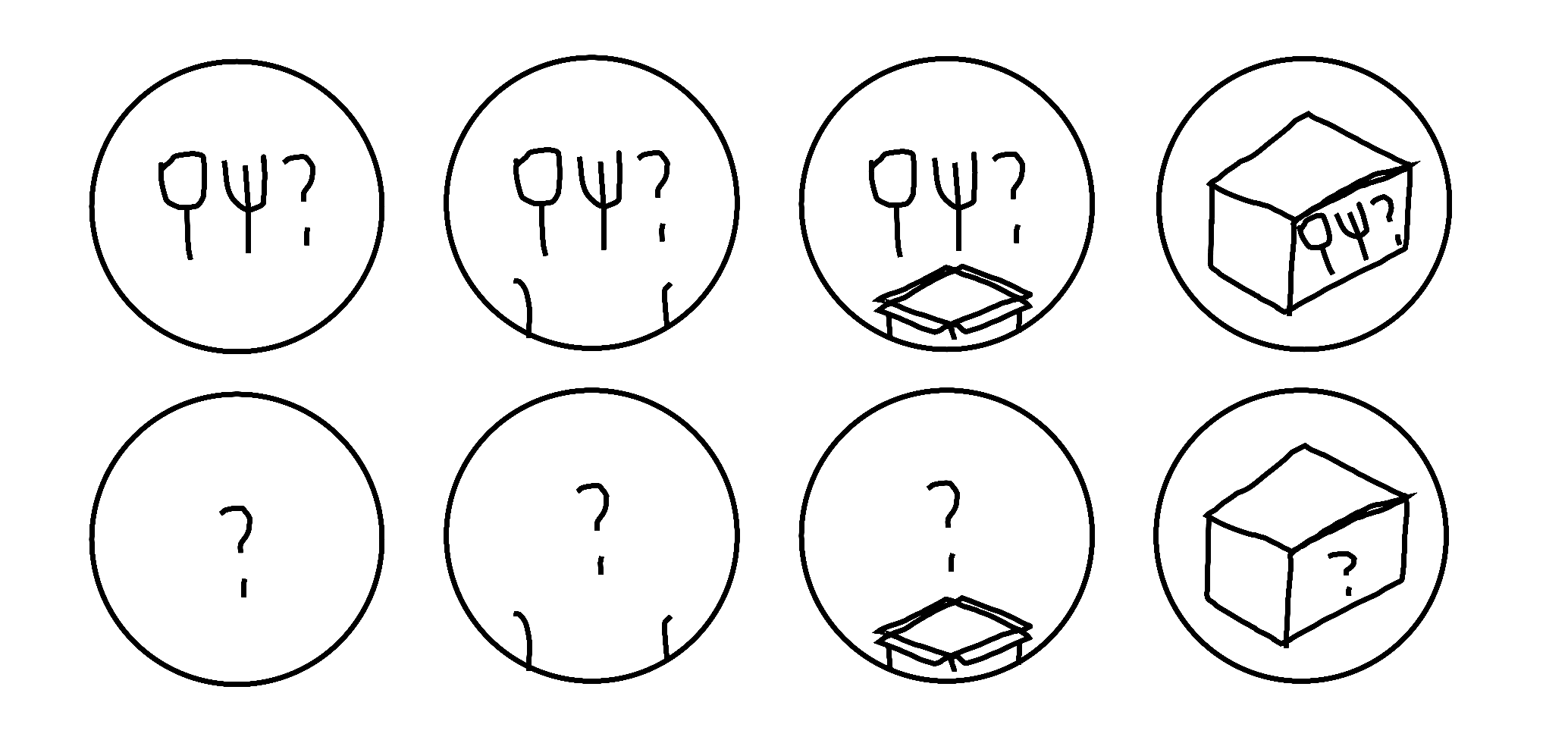
Initially, these are the ideas for the icon, and design keywords are as follow:
However, these designs won’t work for several reasons. Mainly, as our feature will autonomously do something for our user, question-mark-based icons will mislead them, thinking it’s a help or food guide. Pairing those with box illustration did not work as well since it’s either too vague to be understood or too detailed to be noticed.
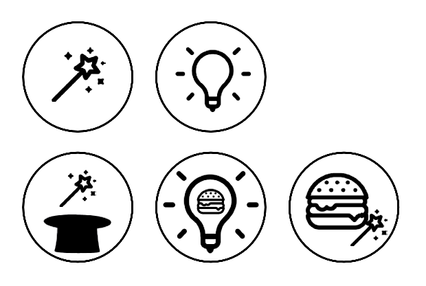
In realisation of our feature doing things “autonomously”, different keywords have come up.
The icons are now a little further from the idea of mystery meal, having no box and no indecisiveness illustration. But on the brighter side, the new icon won’t mislead users into thinking the feature is a guide. The issue here is even the illustration is simplified, the icon still looks cluttered and noisy, and some even leads to another different meaning.

And here is the final design of “magic wand” icon, a variation that will work best in this situation without cramping too much details in the icon. In short, it strikes a sweet balance between usability and aesthetics of both overall interface and the icon itself.
These icons are meant to convey the idea of "tap this and see the magic", which is close to what we intended: "If you press this button, LINE MAN will (magically) choose what I will eat."
The icon uses illustration from FontAwesome 5 assets.
04
Results
Prototype
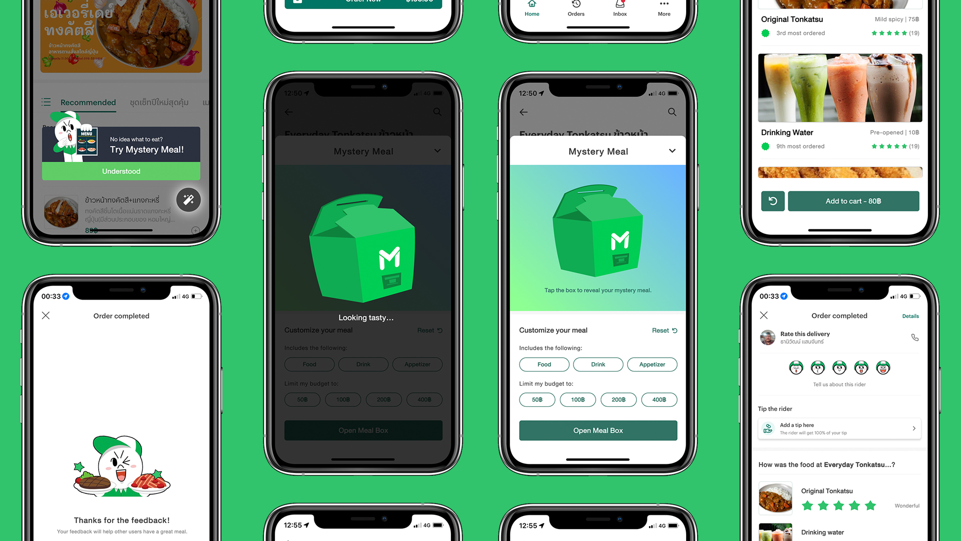
The prototype of LINE MAN Mystery Meal was designed using Figma.
To view the interactive prototype in Figma, view the website in larger screens or click here!
User flow
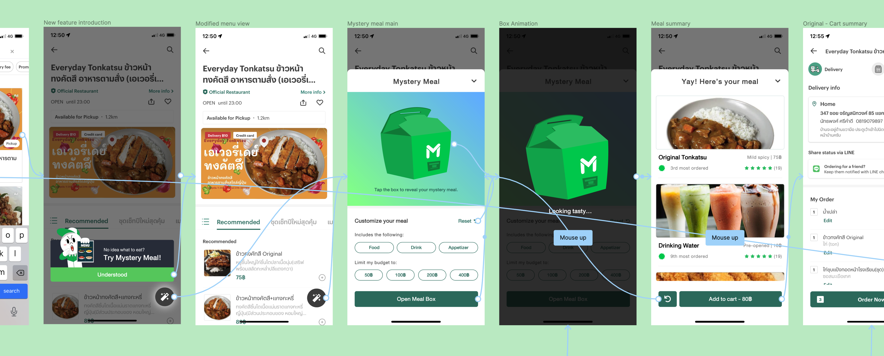
The prototype of LINE MAN Mystery Meal was designed using Figma.
To view the interactive prototype in Figma, view the website in larger screens or click here!
05
Reflections
Utilising knowledge
In this project, I have used UX/UI designing knowledge from lots of past experiences and projects. Because of that, I am able to fluently use Figma as well as present my designs to the interviewer from LINE MAN Wongnai Junior Programme 2022, an internship which I am joining.
Time management
When there's efficiency, there's time.When there's time, there's happiness. When there's happiness, there's an amazing outcome.
As this is a candidate assignment, I have only three days to work on this project, including doing researches, ideating, and prototyping — all of these while taking good care of myself in the process. What I utilised a lot (even nowadays) is the pomodoro technique: working 25 minutes straight with no distractions, have a 5-10 minutes break after, and take a longer break of 15-30 minutes after 2 hours. So even with strict deadline, I have managed to complete the project in time while not causing myself to stress too much.
More to learn, more to explore
Although I had demonstrated my thought processes in this project, I believe there's more I can do to this project if possible, including doing A/B testing of button designs and features as well as post-release usability testing methods and engagement evaluations.
Some might be afraid of getting feedback, especially when doing their first project because they afraid that they will be discouraged or insults from too many mistakes. While I truly understand their feelings, it is more imperative that we see the feedbacks as a way to improve and do better in the future as well as learning another perspectives we might not even considered.
As usual, I have asked interviewers (which are senior designer team members) about the feedback of this project. Apart from the testing that I could have done better with more experiences, I was advised that I should broaden my UI designs by exploring inspirations from online sources so I will have more solutions towards a design problem, which will be helpful in the future.
Attributions:
Image by fullvector on Freepik, Image by fullvector on Freepik