CU Registration Website Redesign
(Unsolicited redesign)
Redesign outdated Chulalongkorn University's course registration website, improving its look and user experience.
Reg Chula Redesign
Unsolicited redesign
01
summary
Updating the outdated
The course registration website at Chulalongkorn University has been given a much-needed unofficial redesign to improve its appearance and functionality. The updated website is sure to delight students who have been waiting for this change. It's great to finally have a reliable and user-friendly platform.
What is "Reg Chula"
At Chulalongkorn University, students use a website called "Reg Chula" to manage their personal information, register for courses, view grades, and request graduation. The registration office is committed to innovative and efficient processing of student registration. The site also has a portal for staff to input grades and manage student information. Overall, the site is primarily used by Chulalongkorn University students.
Scope of the project
This project is aimed to "redesign" the Chulalongkorn University Registration website to enhance both the user experience and user interface. However, the redesign will be limited to the student portal only and will cover most cases of existing students. This upgrade is sure to improve the usability and functionality of the website for students.
Project statusProposed
In 2021, a redesign proposal was submitted to Chulalongkorn University's Office of the Registrar and impressed many staff members. However, the redesign won't be implemented because the staff claimed that the website will be improved soon. Nonetheless, it's promising that the university is committed to enhancing their website.
Looking good, so what happened?
2012 (Wayback Machine)
2023 (reg.chula.ac.th)
This happened. For far too many years, and it hasn't changed yet.
There's a saying in programming humour: "If it works, don't touch it." Looks like the Reg Chula system has followed this philosophy for decades, keeping its icons, styles, layouts, and some backends unchanged. While it's been maintained and promised prompt revamping, the old design still currently in use led to poor user experience for students who still have to use the clunky interfaces.
02
Diving in
Surveying students
To show student perspective and support my claims, I surveyed them through Google Forms. As expected, the results confirmed my statements.
Overall insights
Interface and appearance39
User Experience39
I surveyed 42 university students, 39 of which from Chulalongkorn University, about their school's website for registering for courses. The CU students rated the website from 0 to 5, and the average rating for appearance was 1.76/5, and for usability it was 2.12/5. Even three students from other universities rated their websites poorly as well. So overall, students are not very happy with the look and experience of these registration websites.
Specifics
In a survey, students were asked to specify both what they like and what they don't. Here are their feedback:
• Nothing... (yes, it was the most mentioned keyword in this section)
• The system just works
• Timetable and grade display
• Its simplicity
• Informativeness of the Registrar Office page
• Modern appearance of the website
• Better user flow and course enrolment processes
• Course searching
• Extended auto logout duration
• Better server stability
• Confirmation on each actions
• Improved sidebar navigations
• Saved login information
• Better human verification system
Student's journey
I have been studying how students use Reg Chula, and created a user journey map to help visualise the different stages of the experience. But as expected, the insights I've gained from the map aren't very pleasant ones. Here's the very typical scenario of every Chula newcomers:
Bella is a student at CU who grew up with desires for instant gratification. She can be clumsy and makes mistakes when she's in a hurry. Despite facing many failures, she wants to be successful but sometimes feels insecure.
Bella, a CU student, is on due of enrolling on courses in her next semester. She already had the recommended course list from faculty. However, she has no information on general education courses and will need to look for that.
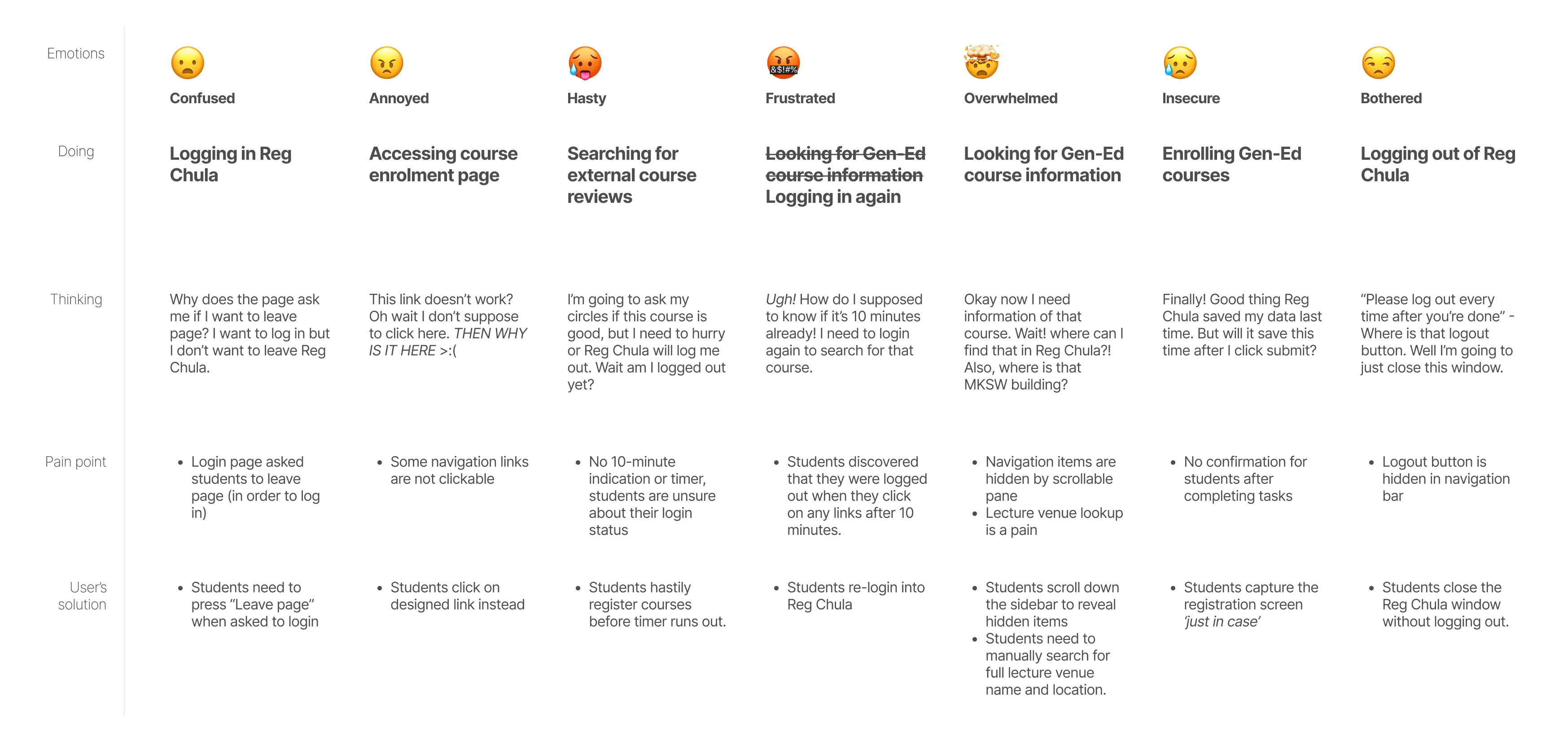
Student's journey* - Bella | Click to view in full screen
As you can see, her experience has go foul since the beginning, and it gets even worse as she progresses through her journey. Eventually, her experience had hit rock bottom when the Reg Chula automatically logged her out without any warning, making her really frustrated and at the same time unsure how to prevent that.
* Emotions are complex. That's why I have excluded the emotion graph normally presented in typical user journey, especially when all emotions here are already negative. For example, insecure, frustrated, and overwhelmed emotions here are the worst in its respective category — worry, anger, and mental load. Anyway, it might be possible to plot it into a graph if preferred, but certainly not optimal for one-dimensional graph in my opinion.
Well, as a user and a designer...
As another student at Chulalongkorn University, I also struggle with the outdated course registration website every semester. The website's design looks old-fashioned and does not provide an intuitive user experience. It's difficult to use, and when grades are released, the site often crashes. These are only some main examples.
Anyway, here are some issues that I have found in the current design of Reg Chula website:
Super dated overall appearance. Contrasts with the identity of Chula, being innovative and knowledgeable.
Colours and typography did not match the corporate identity (CI) of Chulalongkorn University.
No colour system is implemented, resulting in inconsistent design.
UI elements are often misplaced, rendering the website unprofessional.
Low quality graphical assets, leaving the impression of poorly made website.
Some paragraph texts used tiny fonts and too bright colours, making them hard to read.
Inconsistent layout and spacing, making the website, again, unprofessional.
The layout is not responsive, leaving too much blank space.
Some elements appeared as "links" while it's not, breaking user's trust.
Use confusing terminologies such as "ตรวจสอบผลคะแนนสอบ (View test results)" and "ผลการศึกษา (View grades)"
Some important elements such as "Logout" button is hidden and requires user to scroll through.
Some links, specifically "Login" button is not needed when user is logged in.
No indication of 10-minute timer, leaving users to guess whether they're auto logged out or not.
No confirmation dialog box after successful task, making users insecure of their actions.
Unintuitive and boring user experience. Lacks user automation and assistance.
You might noticed that I've left out non-design issues like server crashes and slow loading times above since it's not about to the "design" of the website. However, I'll still look into the technical aspects of Reg Chula as it is still related to the design and implementations.
Exploring technicalities
Imagine you're renovating a room in your home. To make the process efficient and error-free, you would need to understand the structure of the room and the materials used to build it. It's the same for a website redesign. Knowing the framework and technical aspects of the registration website helps speed up the process, allowing developers to easily apply the new design as well as solving the issues more accurately. By having this information, we can save time and resources, and implement a better user experience faster.
UI Framework
The CU Registration Website is still using Bootstrap 3 (v.3.3.6), while the current version is Bootstrap 5 which has new and improved features. However, it has some breaking changes that require developers to learn and adapt to the new version. Still, upgrading to Bootstrap 5 is highly recommended as it improves responsiveness and includes helpful features like flexbox and flex item alignments.
Frame rendering
The CU Registration Website uses two frames to render pages instead of separate pages for each function. This means users navigate using form submission, which can cause issues like accidentally pressing the back button and being logged out, leading to a poor user experience.
03
Redesigning

Building design system
First thing first, we need to build a new design system for Reg Chula in order to create a clean, coherent interface. In this design system, I used fonts and colours from Chulalongkorn University's Corporate Identity Guidelines, which will ensure consistency with other university websites, including the main Chula site.
A/B Testing
I've done the A/B testing of my new designs to see if the new design really worked. As expected, students overwhelmingly preferred the new design. Still, I've created multiple iterations of each page in the new design and let the students choose their favourite.
The new design's A/B testing is done on Instagram story as it does not look intimidating, requires only a short time when compared to the proper survey which many tends to stay away, and has maximum potential to reach users, precisely but not limited to Chulalongkorn University students (aka. my friends, seniors, and juniors) possible for me at the time. Here are the major ones that I've found interesting:
Core design
A new iteration is meant to utilise spaces more usefully and feature lighter colours as well as context-based element colouring (information, warning, and urgent). The result showed that users value those changes and prefer the new ones.
Login screen
I've tried adding backgrounds to the service page including CU pink colour and image background as well as rebuilding the login pane. The result showed that students loved the image background coupled with newly rebuilt pane.
Sidebar
As the original sidebar is coloured and the rest isn't. I really worried that if the colour were to be changed to more vibrant pink, it will be too bright, but I did the testing anyway. The result showed that users preferred lighter variations
Transcript view
To go creative, I want to find out that whether students will value the grades display more than the old tidiness of the transcript. The result summarised that users really prefers tidiness more than all else.
Course information
Here, the newer variation (left) has more compact data display, and the older version has expansive and spanned information display. The result showed that users preferred the compacted design more.
04
Results
Prototype
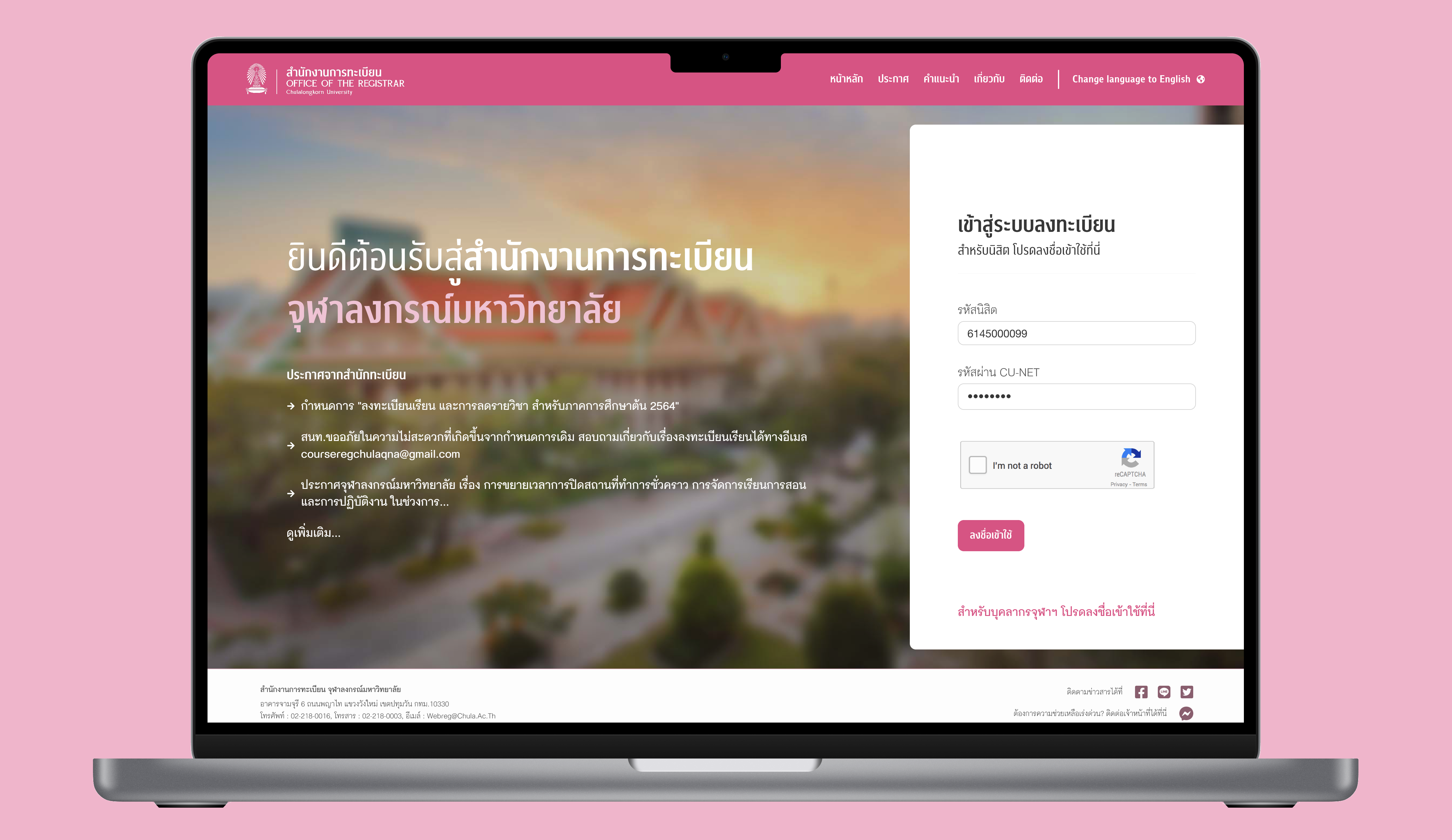
The prototype of Reg Chula redesign was made using Figma.
To view the interactive prototype in Figma, view the website in larger screens or click here!
The desktop version of Chulalongkorn University Registration website has been redesigned to offer a more visually appealing and user-friendly interface with improved navigation and functionality. Feel free to try the prototype!
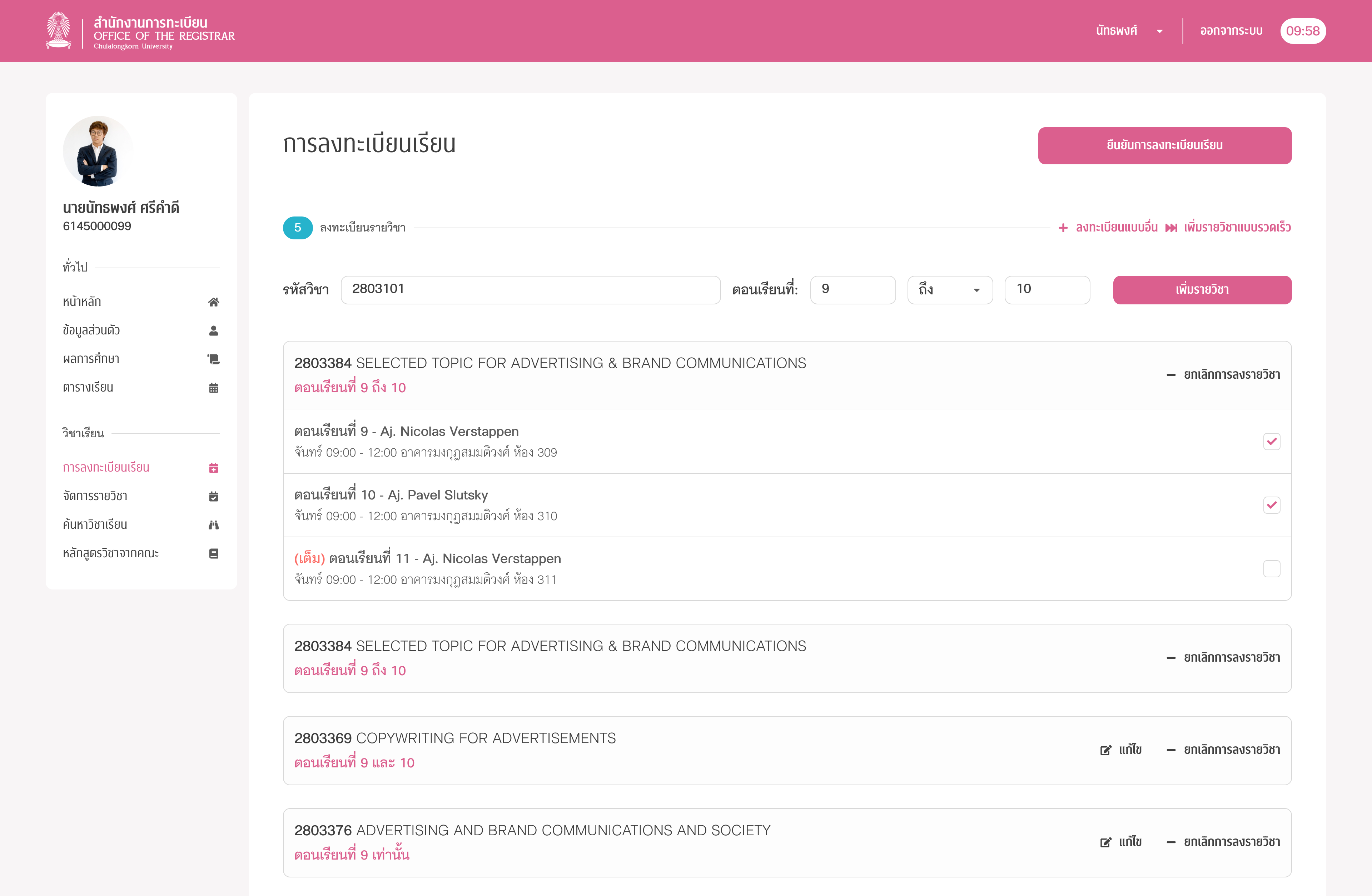
New appearance
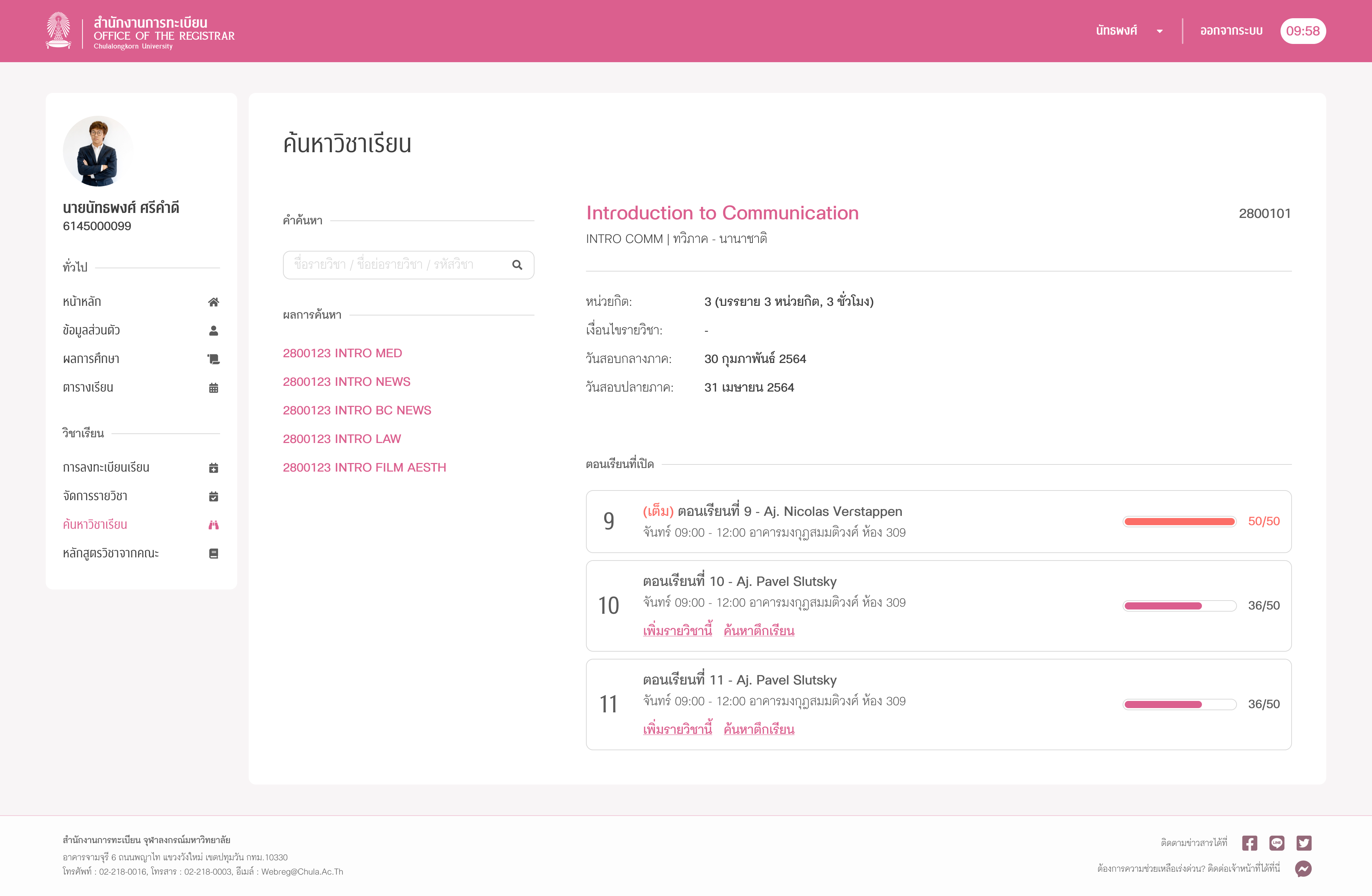
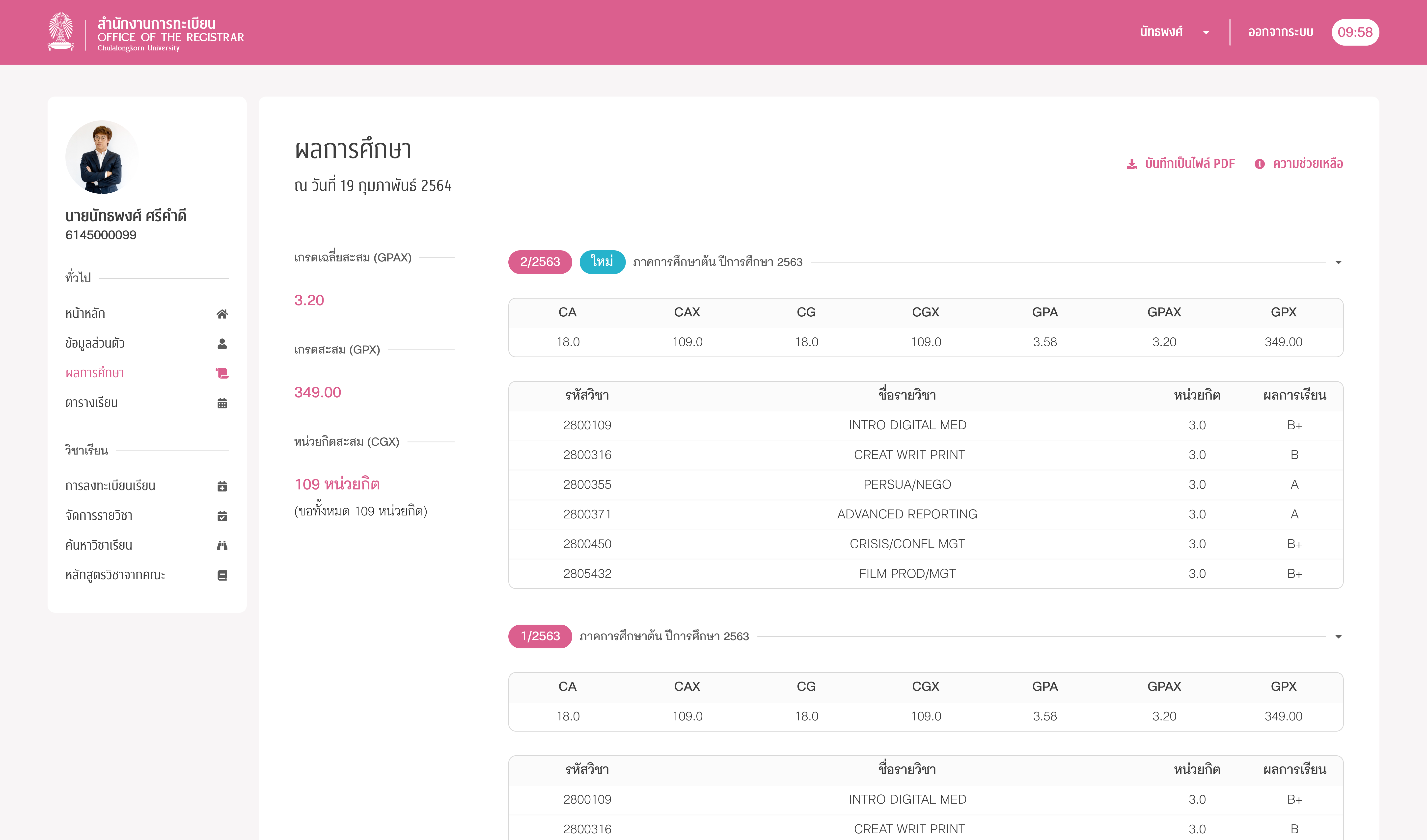
The redesigned user interface aims to both enhance the user experience and ensure current users feel at ease with the changes so any drastic modifications, such as relocating navigation bars or reimagining the transcript display page, are avoided. However, most of the UI elements are restyled, including buttons, links, selectors, and input fields, in accordance with the newly created design system. These elements now include icons that provide clear visual cues to their functions, resulting in easier to use interface for both existing and new students.
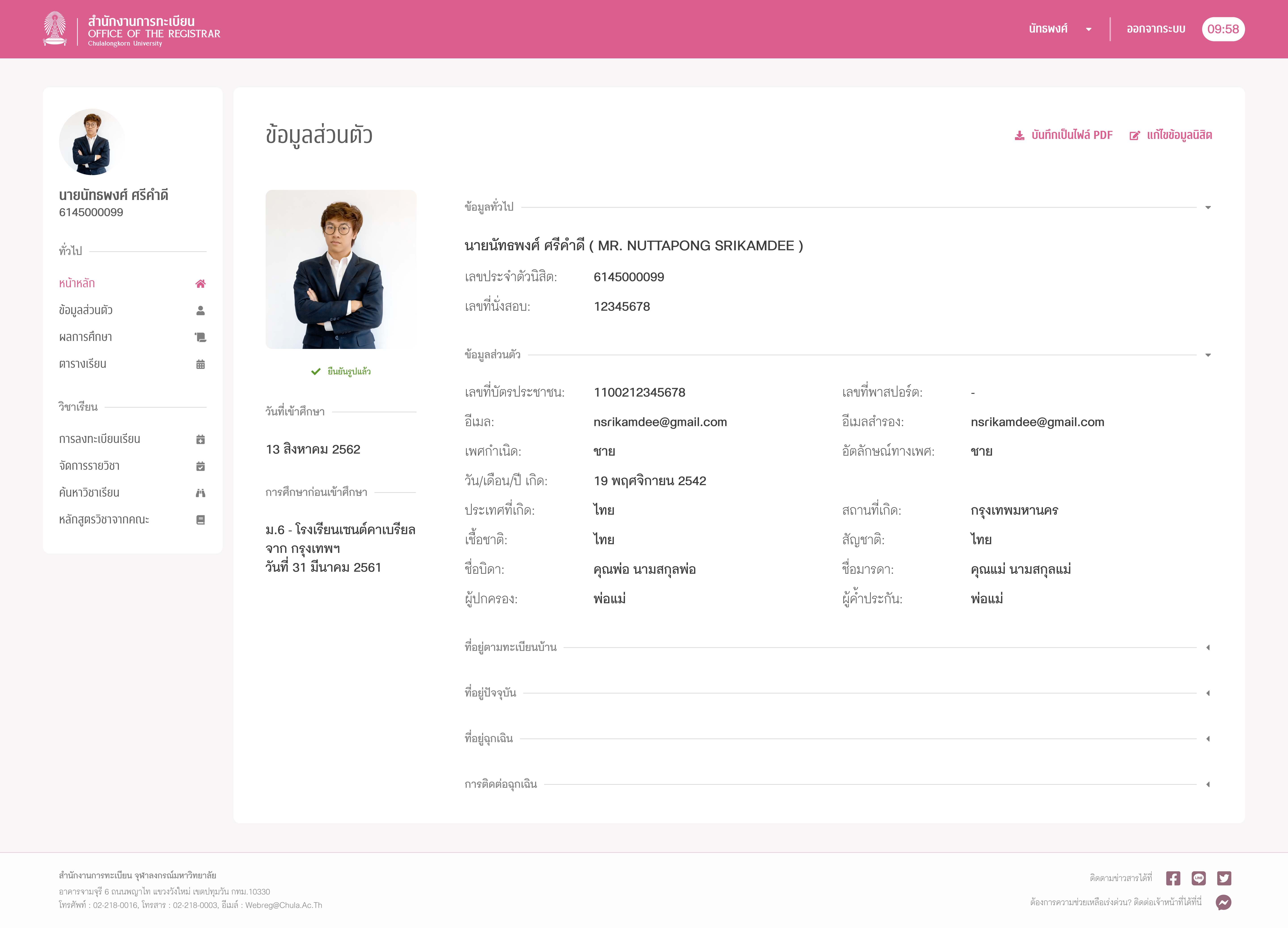
Reorganised and streamlined
The redesign includes a handy collapsible element that neatly organises data categories for easier viewing. The familiar two-column layout with navigation and content columns is unchanged, and navigation bar items are still categorised as before. If the developers prefer the old frame rendering method, it's still an option.
To streamline the interface, redundant pages and UI elements that are hardly used are omitted. For example, the "search course by test date" are now gone and "view test scores" options are now hidden by default, making it easier to navigate and reducing confusion.
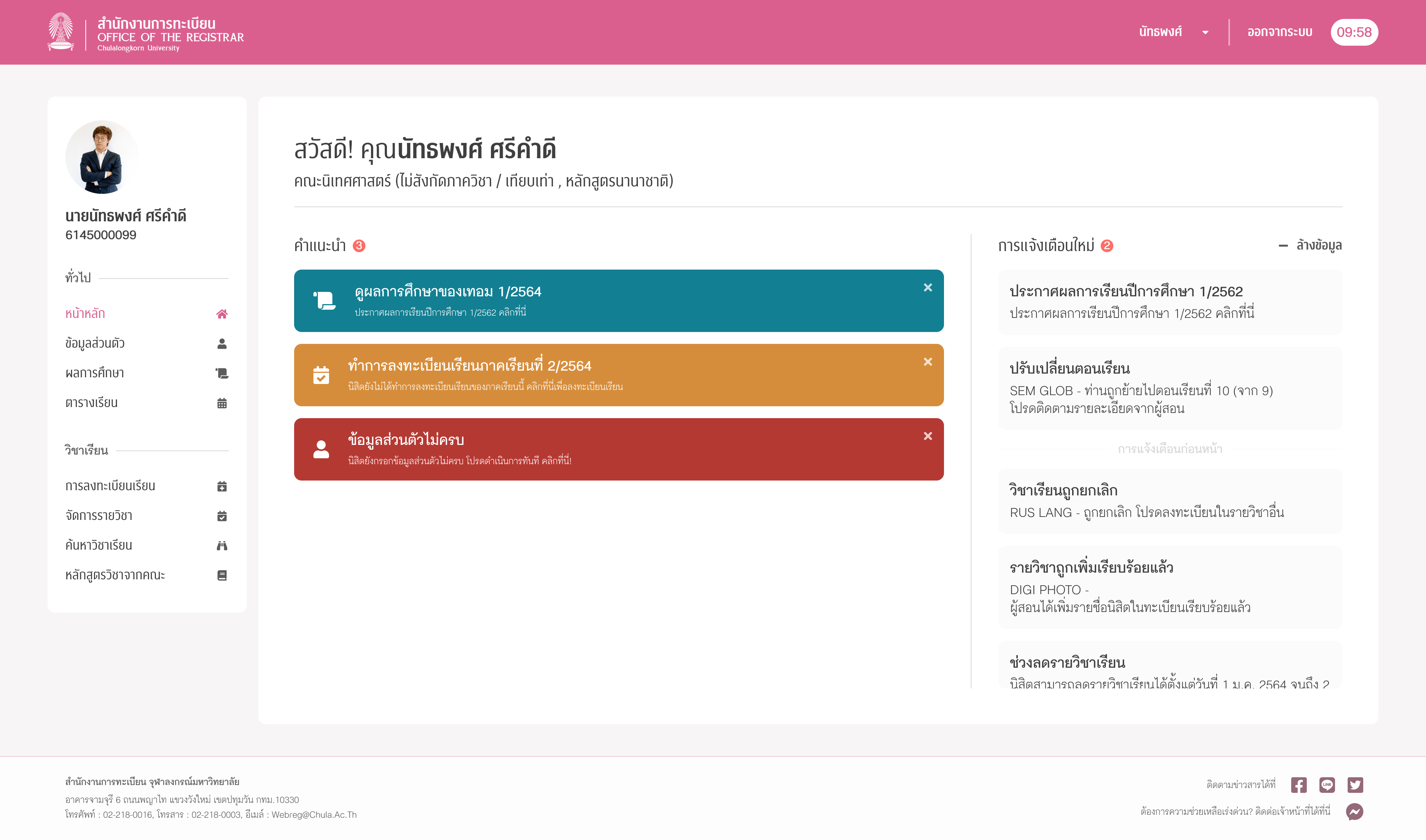
More useful homepage
The homepage has been redesigned to give students quicker access to the actions they need to take based on their information and status. For instance, Reg Chula will suggest student's actions when :
• A student's information is incomplete
• A student hasn't registered for courses in the current semester, or
• Grades for the latest semester has been announced
To make things even more convenient, notifications are added on the right-hand side of the page. This will keep students informed about their registered courses, general system notifications, and non-critical information.
Faster, more intuitive
Now the redesigned Reg Chula will work harmoniously with students and provide them with useful information. Students now can access information related to their tasks as well as recommended actions for their current tasks. This includes:
• Ability to register courses and view lecturing venues right in the course information viewing page.
• Search history of the "Search courses" page
• Current number of selected courses in registration page and completed courses in recommended courses page.
As for manual input in registration page, I discovered that inputting the course number is the fastest and most accurate way. Anyway, after manually inputting course ID, users can now view courses added as well as re-selecting class sections or remove courses.
User testing
After successfully redesigning the registration system's interfaces and user experiences, I have asked for feedback personally as well as in Instagram story about the newly designed website. Students were delighted to see the refreshing look of the registration website and really wished the design will be implemented.
However, the only issue here is the testing is done in only a small scale and should be conducted on more samples (students) if the design is really to be implemented. We can use analytics like hotspots and user behaviour to find any other issues with the Chulalongkorn University Registration system or the new UX/UI. Plus, we can also do formal user testing using CUNEX, the university's official mobile app.
05
Reflections
Freedom in designing
In this project, although I have considered I am delighted that I can (re)design this website without any major limits such as time and financial concerns and do additional processes such as refined user testing and digging deep in the technical aspects of the project.
Testing uncovers a lot
In the A/B testing steps, even for the variation of designs that I expected to gain popular votes because it is aesthetic and nice overall, users did not prefer it as much as I thought. And after getting additional feedbacks, they actually have very valid reasons. This in turns highlight the issues and help improve the (re)design that I'm doing more precisely.
Testing methods
I discovered that (way too) many people avoids formal surveys — the one that comes in forms and with loads of questions, making it a pain point in finding pain points (pun intended).
This is evident in my Google Forms survey vs Instagram Story Polls quick survey. Although my Google Forms questionnaires are very streamlined and took less than two minutes to complete, people still stay away from it as they think it will be long just like others. On the other hand, an A/B testing in IG story polls has collected hundreds of feedbacks in every posts.
If it's needed, such as surveying corporate members or similar, the forms are still a very good choice. However, in testing with similar demographics to us, social media is proven to be very helpful.
Using gained experience
Before this project comes to the current version, I have previously done a redesign of Reg Chula before — without any UX/UI organisation knowledge. But after finishing an internship at Magnetolabs, I have gained a lot of experiences including using Figma as a prototyping tool, utilising design systems, grid systems, layouts. After revisiting this project with more experience, I have addressed numerous issues in my design (as well as my portfolio website) and decided to reiterate the design in Figma to exercise my skills.
